# Editor User Manual
| Document Version | Content Revision | Reviser | Revision Date |
|---|---|---|---|
| V1.0 | Official Release | Wang Yao, Gao Guanghui | 2020-12-10 |
| V1.1 | Added descriptions for new features | Wang Yao | 2021-01-23 |
| v1.2 | Added example of using scripts to initiate network requests | Wang Yao | 2021-03-08 |
| v1.3 | Updated basic process document and supplemented new features of the event system | Wang Yao | 2021-08-08 |
| v1.4 | Added font description | Wang Yao | 2023-04-20 |
| v1.5 | Updated document content and added variable descriptions | Wang Yao | 2024-01-17 |
| v1.6 | Updated document content | Wang Jiale | 2024-09-11 |
| v1.7 | Updated document content | Guochenghao | 2024-09-20 |
This manual is for the usage of the editor. For deployment processes, please refer to the Deployment Manual.
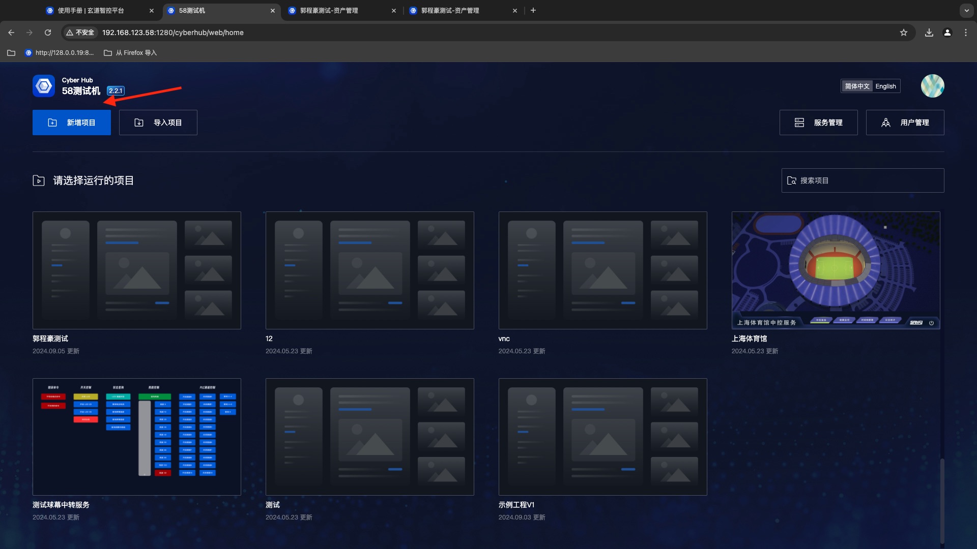
# Homepage Introduction
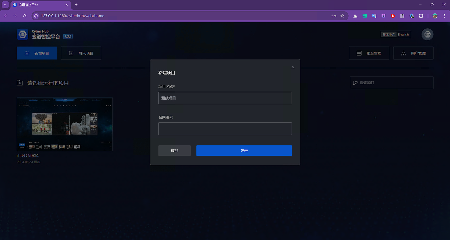
# Create Project
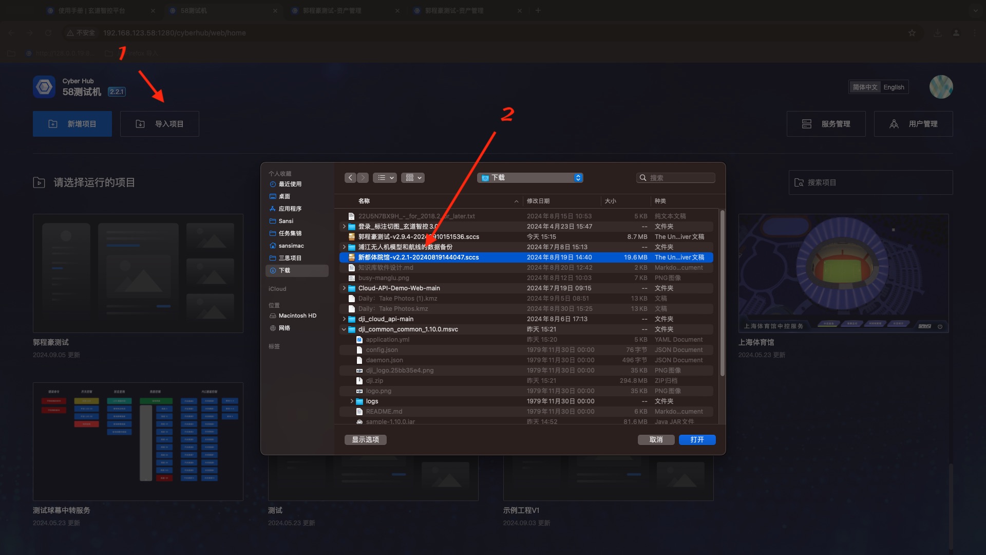
# Import Project
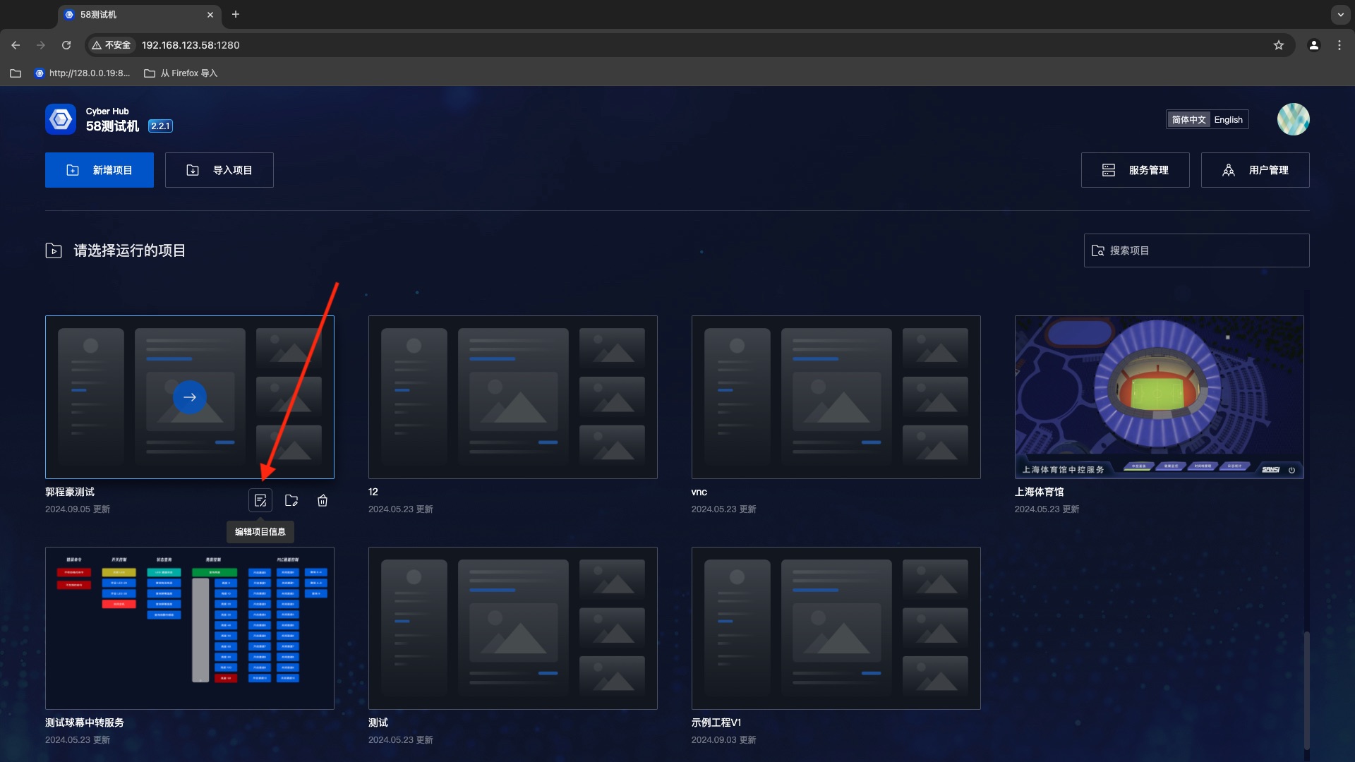
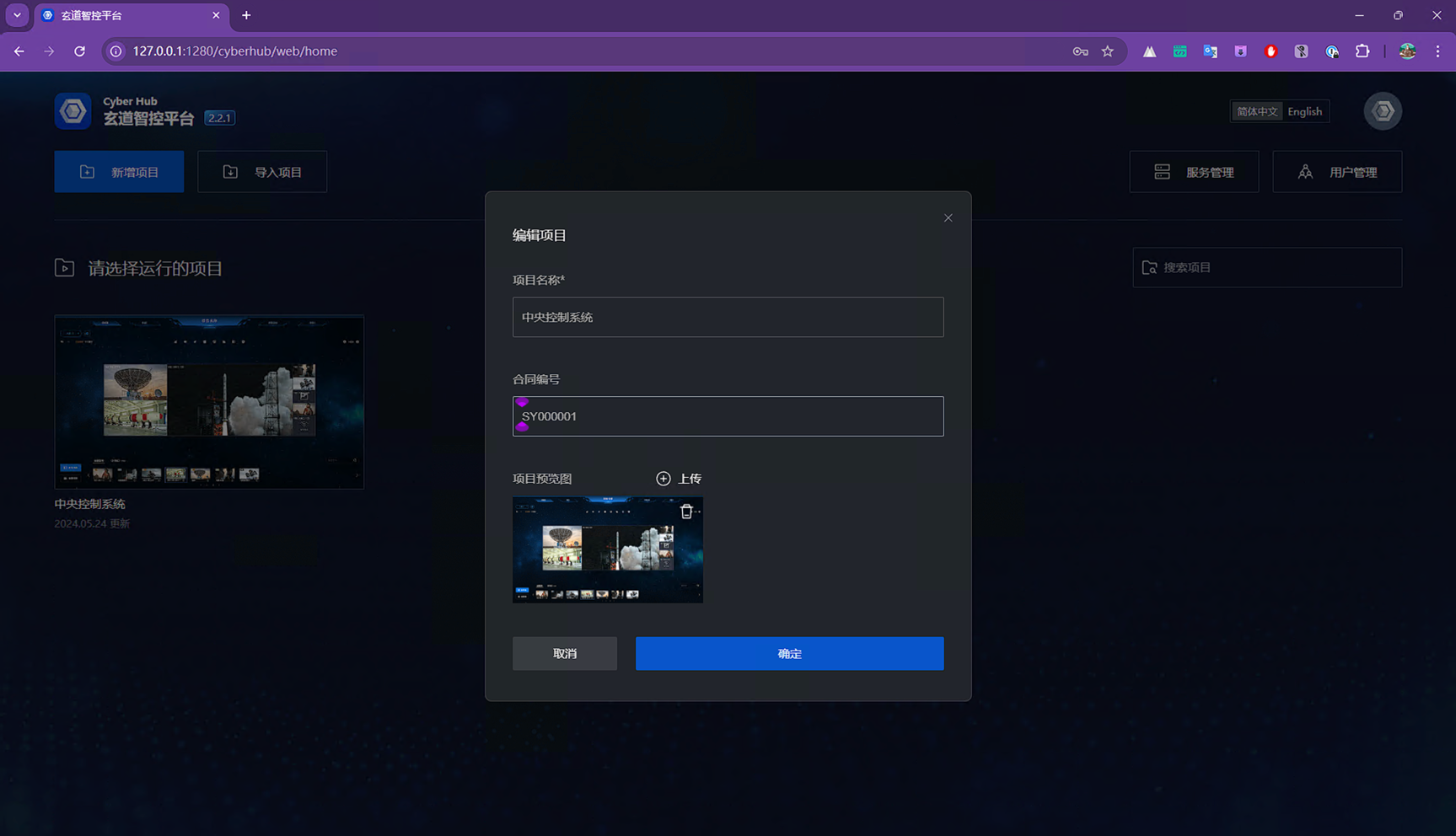
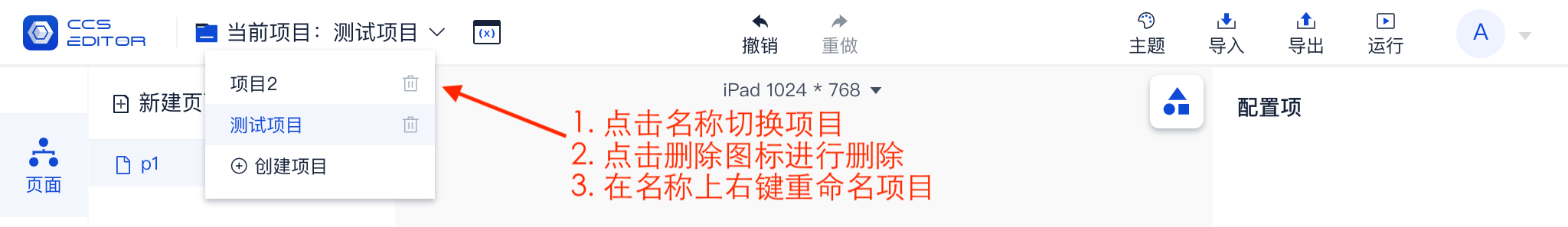
# Edit Project Information
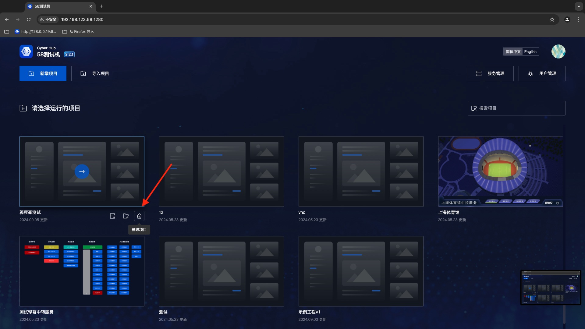
# Delete Project
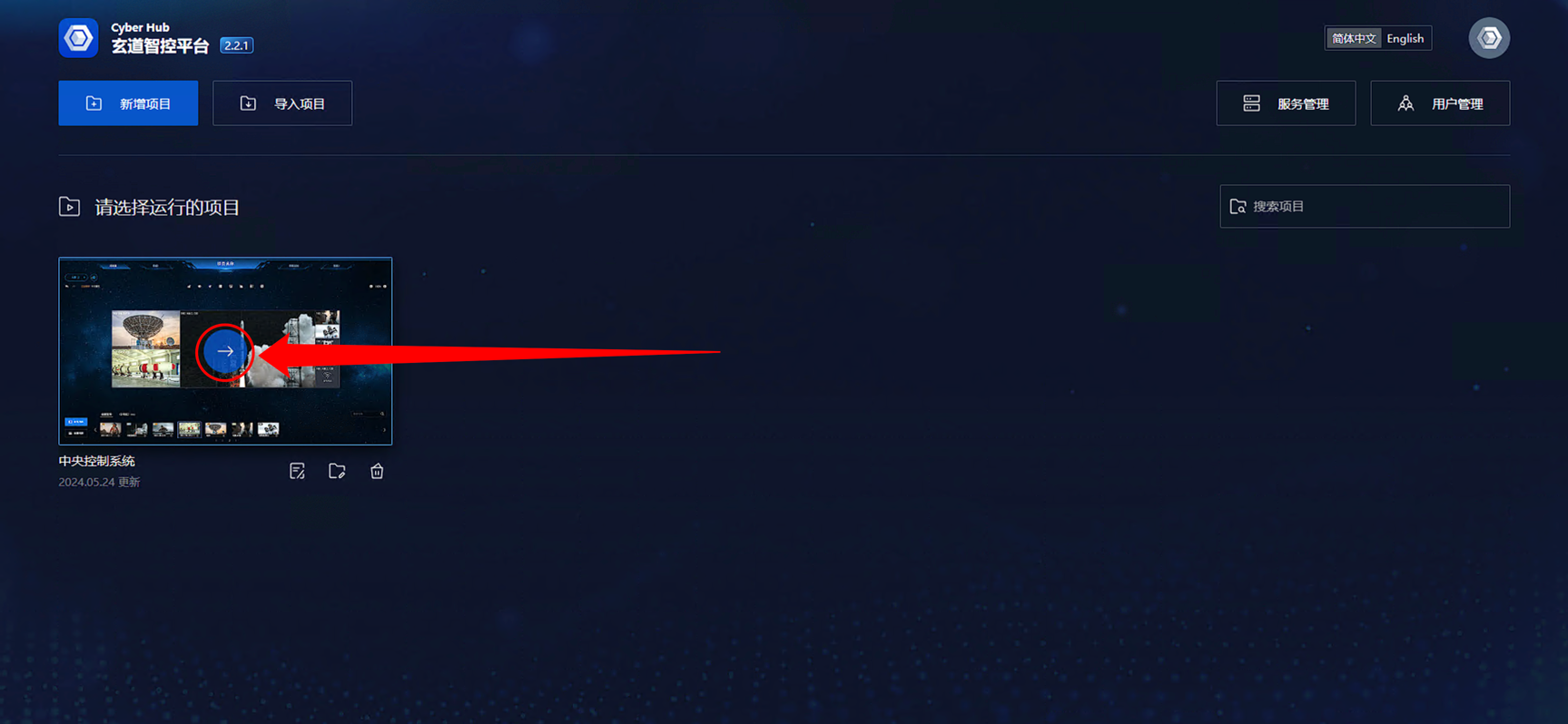
# Run Project
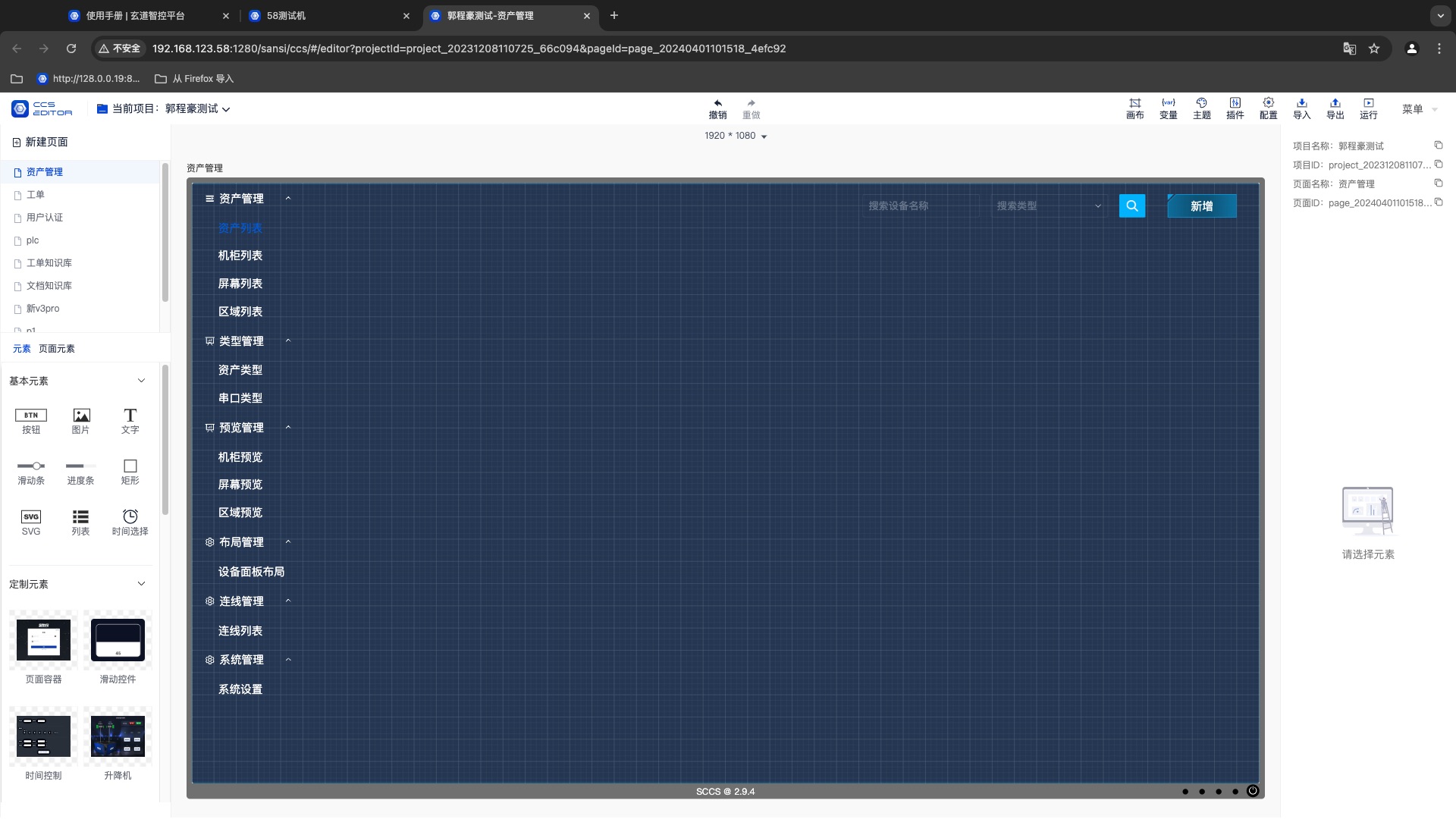
# Enter Editor

# Menu
A project is a basic container, a collection of several pages and functions. Each project can be considered as an App.
# 1. Project Menu
In the top navigation bar, you can view all projects, switch between editing projects, and create or delete projects.
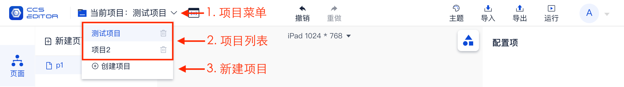
# 2. Project Menu Functions
In the menu entries, different operation methods correspond to different functions, as shown in the figure below.
# 3. Import and Export Project
Projects support offline backups and data sharing through the export function, and loading backups or shared data through the import function.
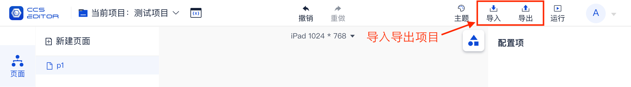
The exported file format is .sccs, short for SANSI CENTER CONTROL SYSTEM.
The exported file is stored in the user's download directory, with the naming format: ProjectName_v1.0.3_20210101081500.sccs.
It is recommended to use the export function to back up the project to external devices after editing the project. In case of data loss due to hardware damage, the backup can be restored.
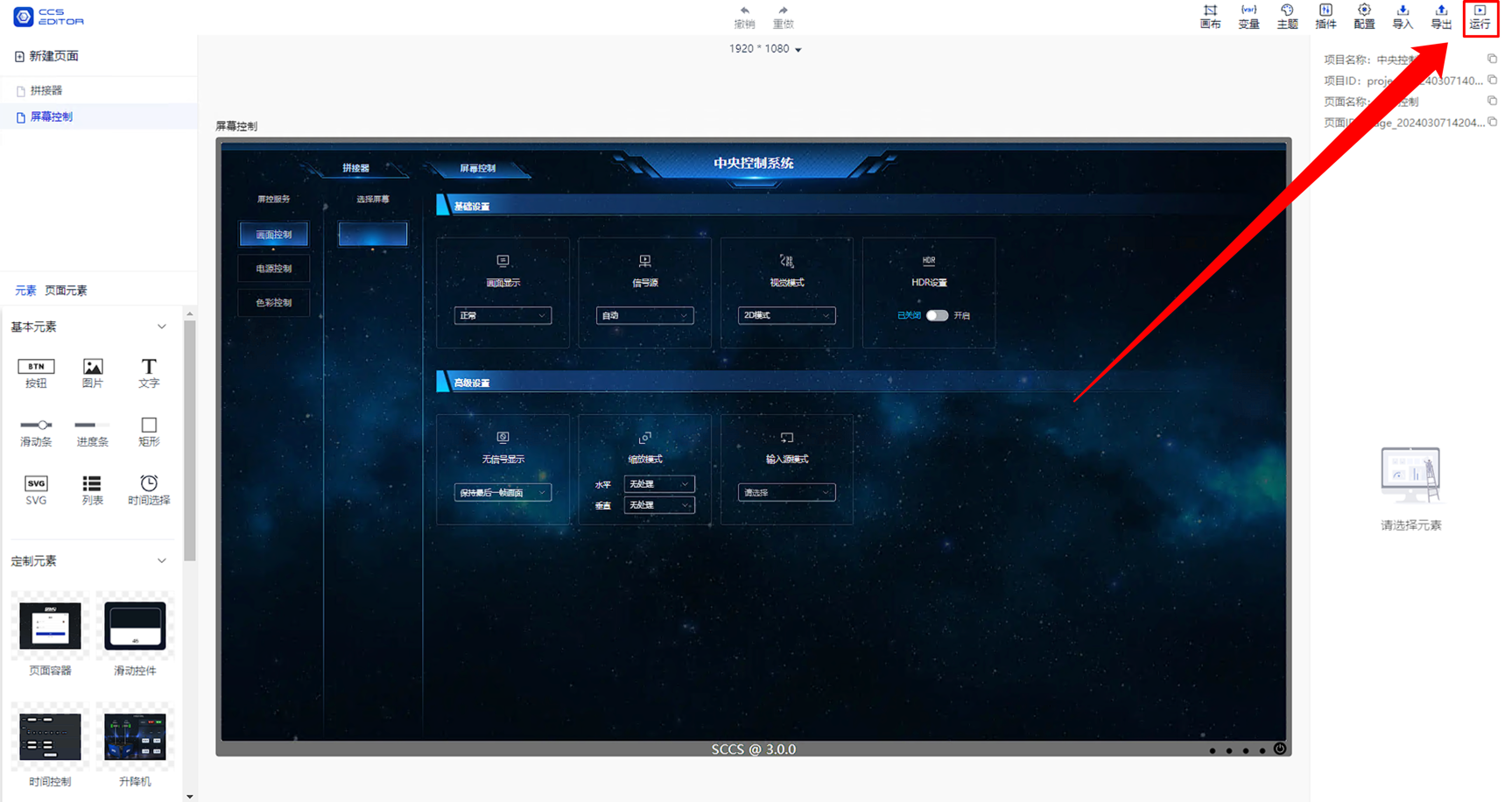
# 4. Project Run Entry
After editing the project, click the 【Run】 button in the upper right corner to run the project.
# Pages
All the content displayed during running is based on pages, which are similar to web pages or mobile application pages. However, in this system, the content displayed and the corresponding functions on the pages can be edited and adjusted.
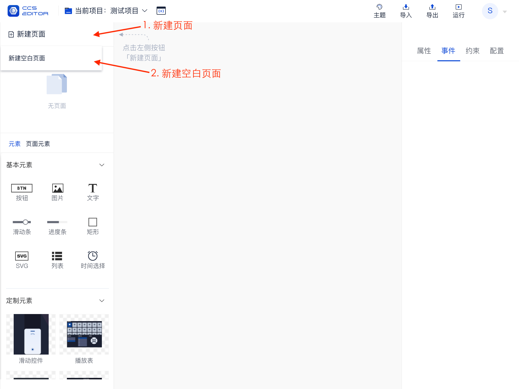
# 1. Create New Page
Multiple pages can be created in a project, allowing you to create a brand new blank page.
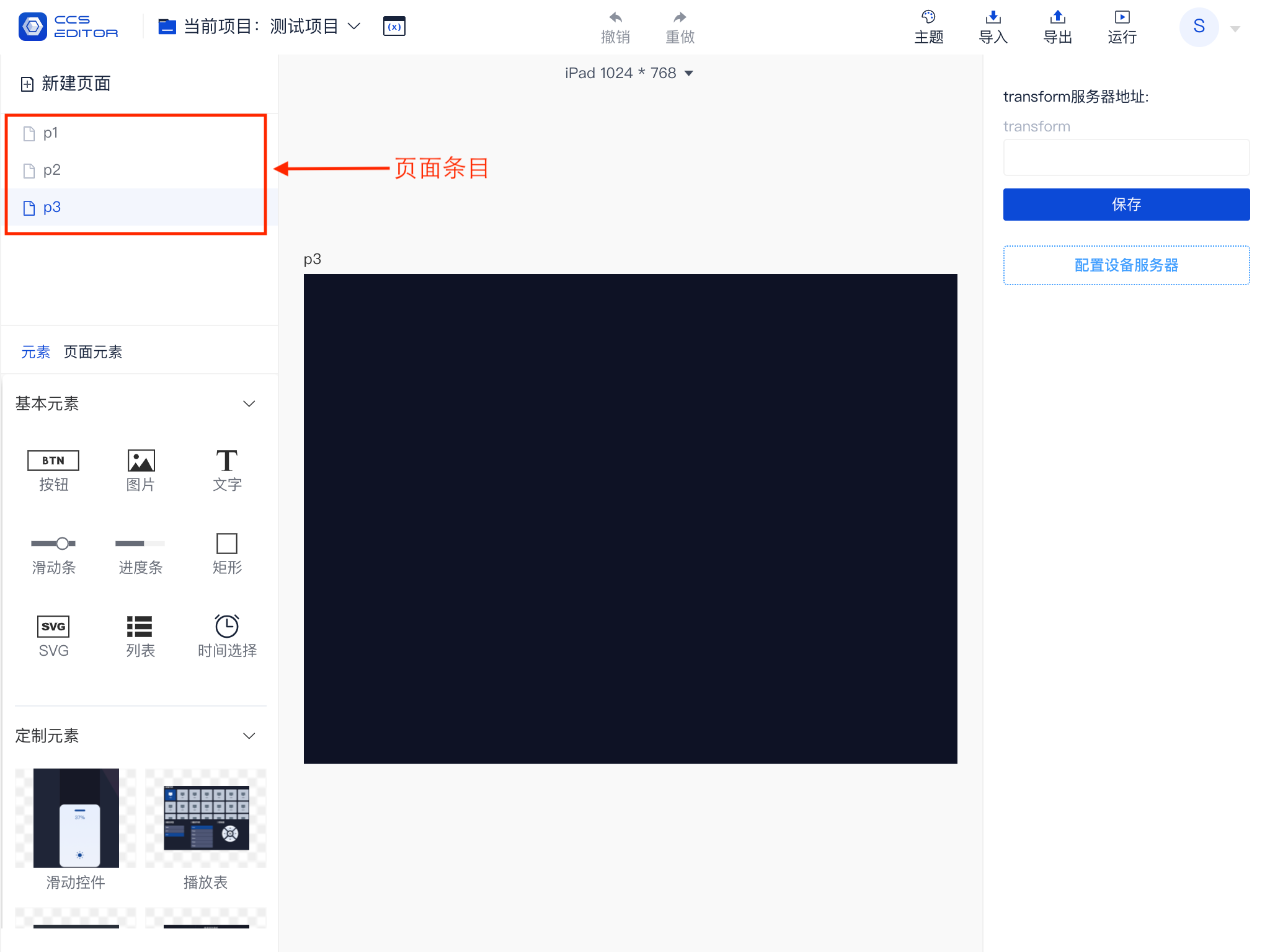
# 2. Page Entries
When multiple pages are created, multiple page entries will exist simultaneously as shown below.
- The light blue background indicates the currently selected entry, meaning that the current editing area displays this page.
- Clicking on the page entry will switch to that page.
- The first page is the homepage when entering the application by default.
- You can drag and drop page entries by clicking and holding the entry with the left mouse button to reorder them.
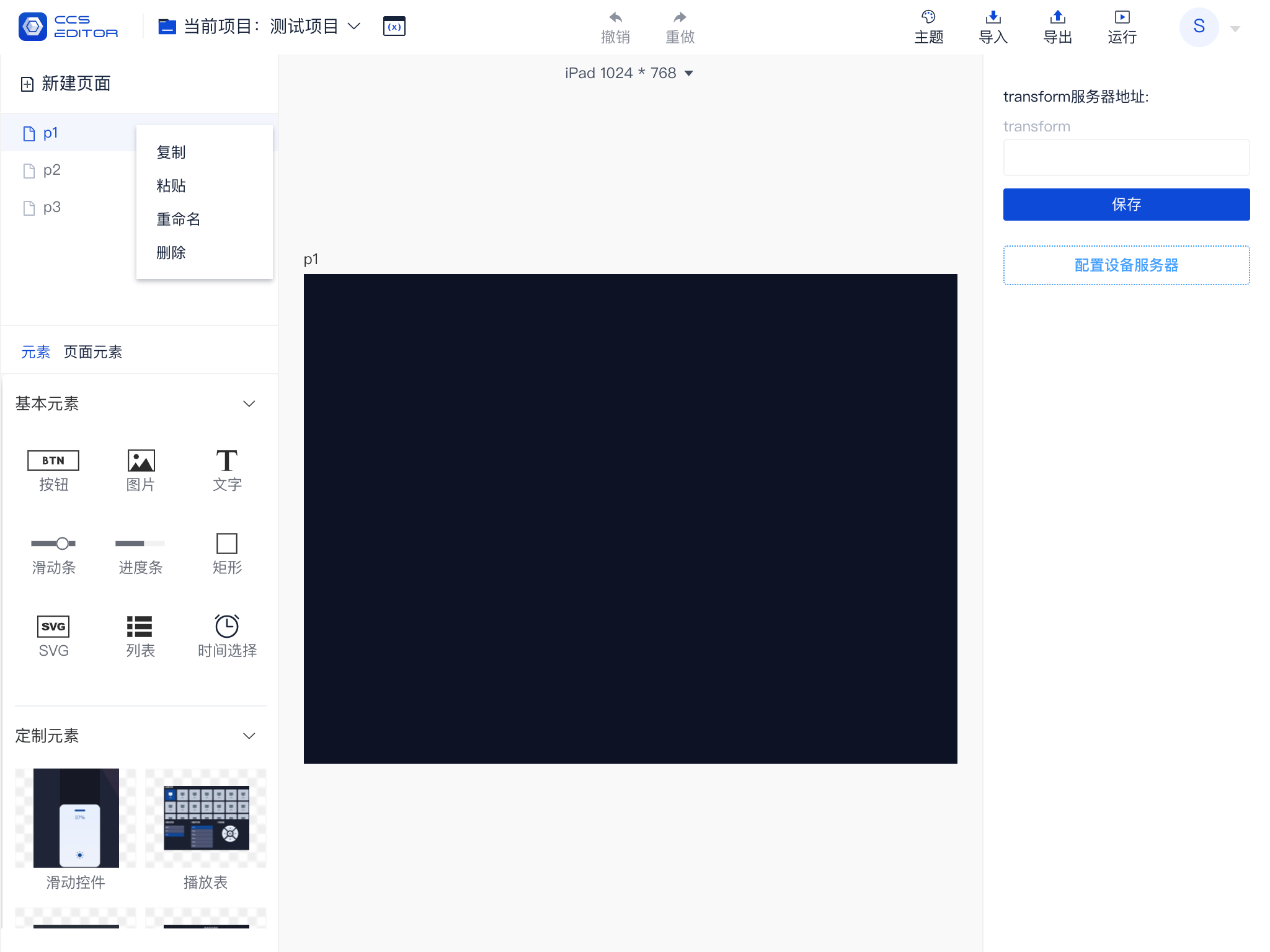
# 3. Page Entry Menu
Right-clicking on the page entry will expand a menu that provides additional page operation functions.
- Copy Page: Copies the current page to this project.
- Cut: Copies the page to the clipboard for later pasting.
- Paste Page: Pastes the page data from the clipboard into the current project.
- Rename: Renames the current page.
- Save as Template: Saves the current page as a template.
- Delete: Removes the current page from the project.
# Elements
All content added to the page is referred to as elements (or components). Different elements have different functions and roles. In this platform, there are:
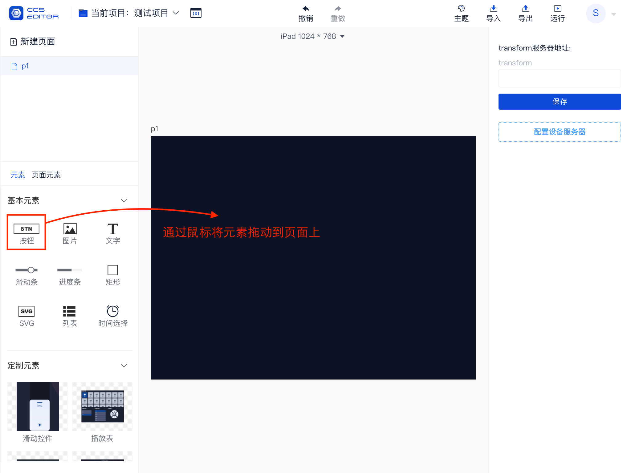
# 1. Add Elements
All elements are found in the element panel, which can be added to the page by selecting and dragging. There are currently 9 basic elements and multiple custom elements. For details on elements, please refer to Appendix: Appendix Three: Basic Elements.
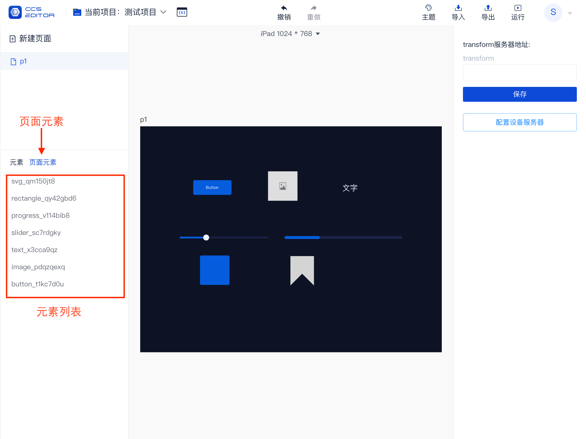
# 2. Element List
The following shows how the 9 basic elements look when added to the page. When an element is added to the page, it will be displayed in the left-side element list (highlighted in the lower left corner). The list displays in order. If there are hierarchical relationships or overlapping elements, you can try adjusting the sorting method to resolve the issue.
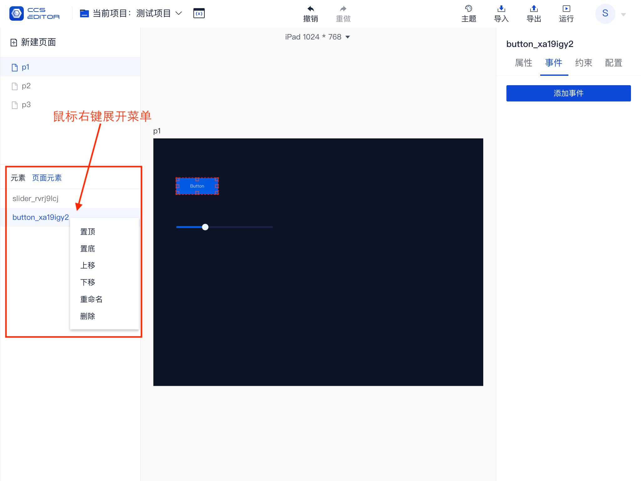
# 3. Element List Menu
Right-clicking on an entry in the element list will expand an operation menu, allowing you to perform basic operations like sorting, renaming, and deleting elements.
Note that the element name is its unique ID, which is very important in element operations.
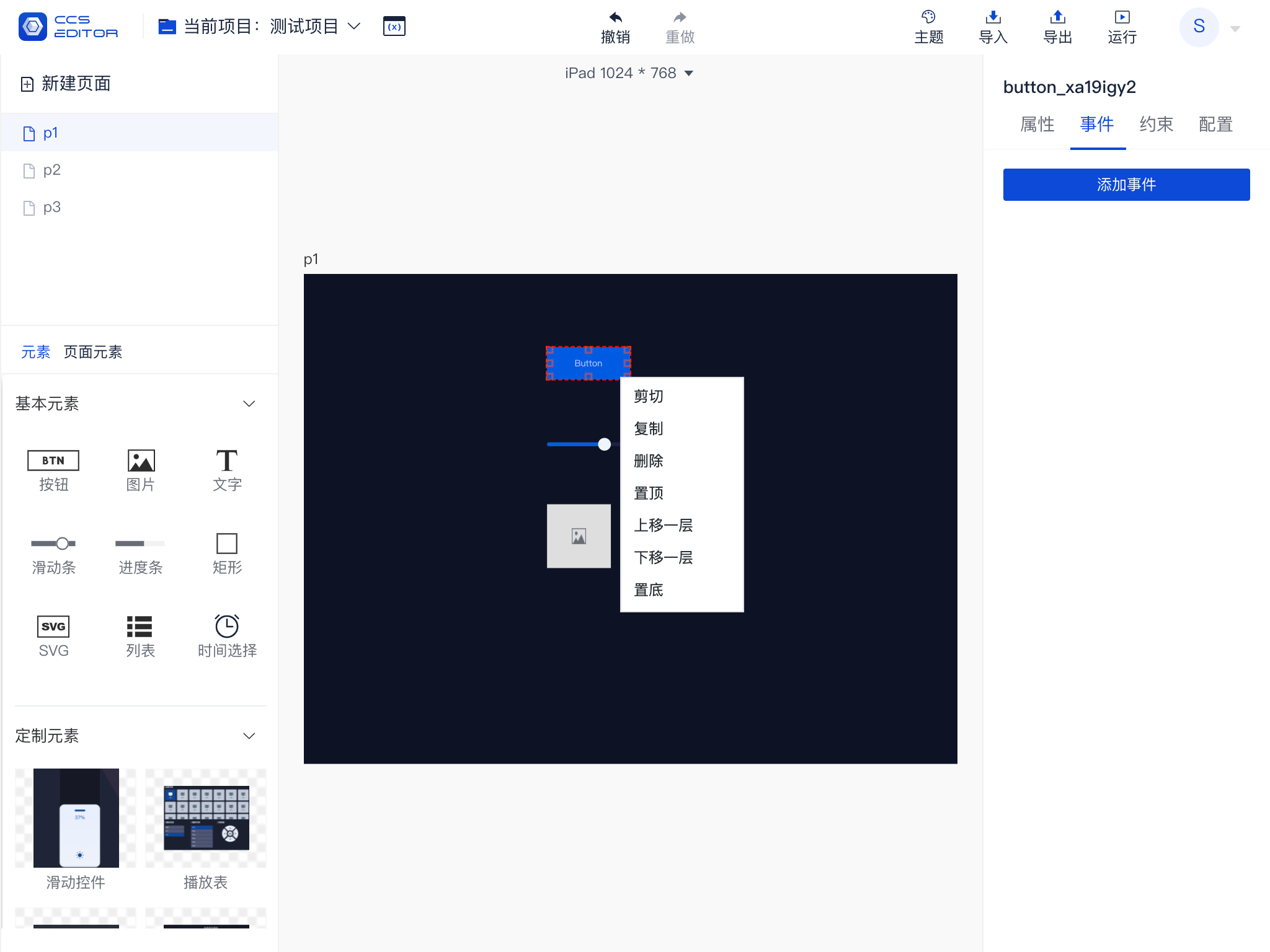
# 4. Element Menu
Right-clicking directly on an element or selecting an element and right-clicking will expand that element’s menu. This menu, in addition to the sorting function in the list menu, also provides options for cutting, copying, and pasting.
Elements can be cut (copied) after being selected. The cut (copied) elements support pasting across pages and projects. You can also paste elements in an empty area of the editing area via the right-click menu.
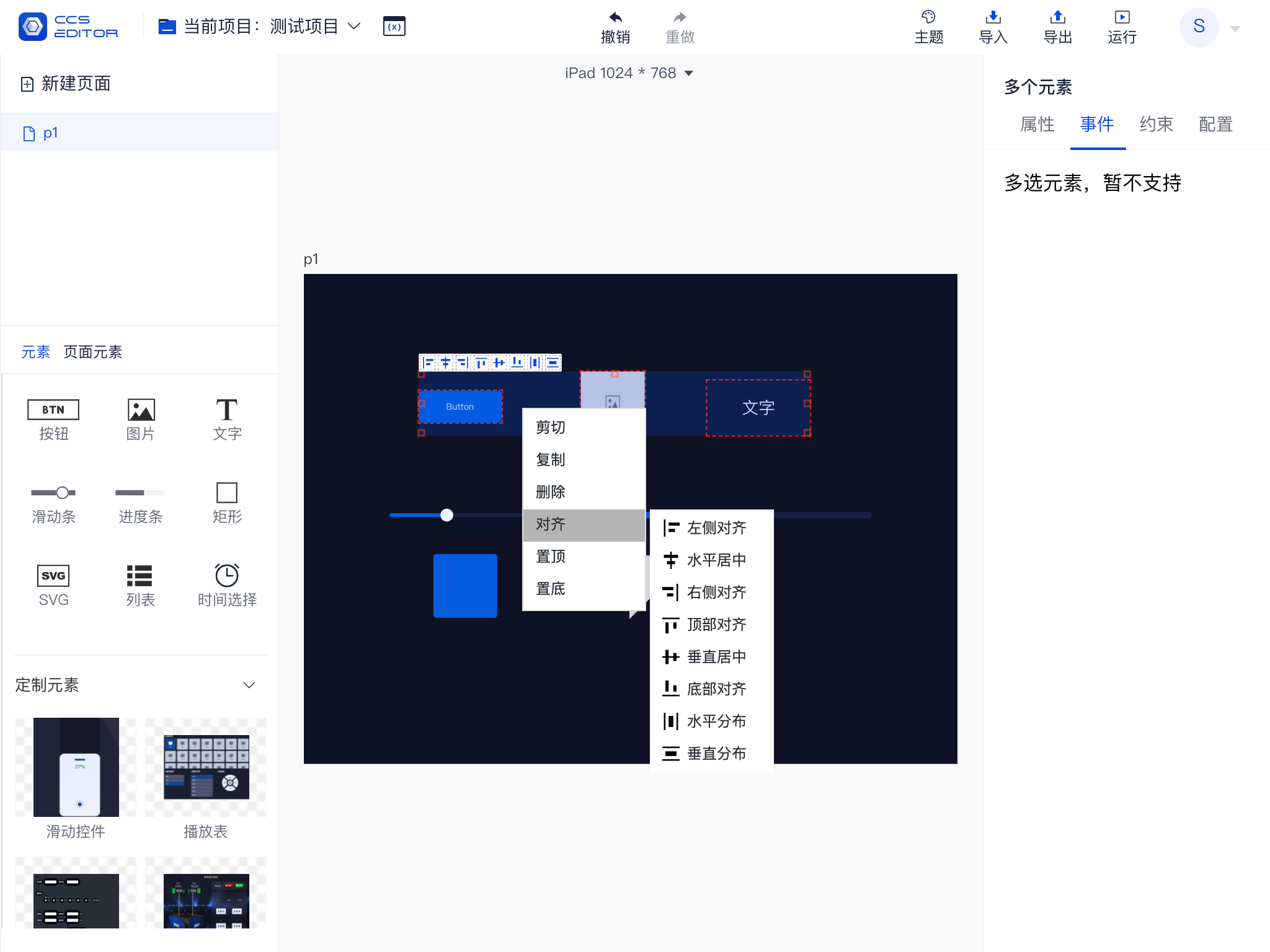
# 5. Multiple Element Selection
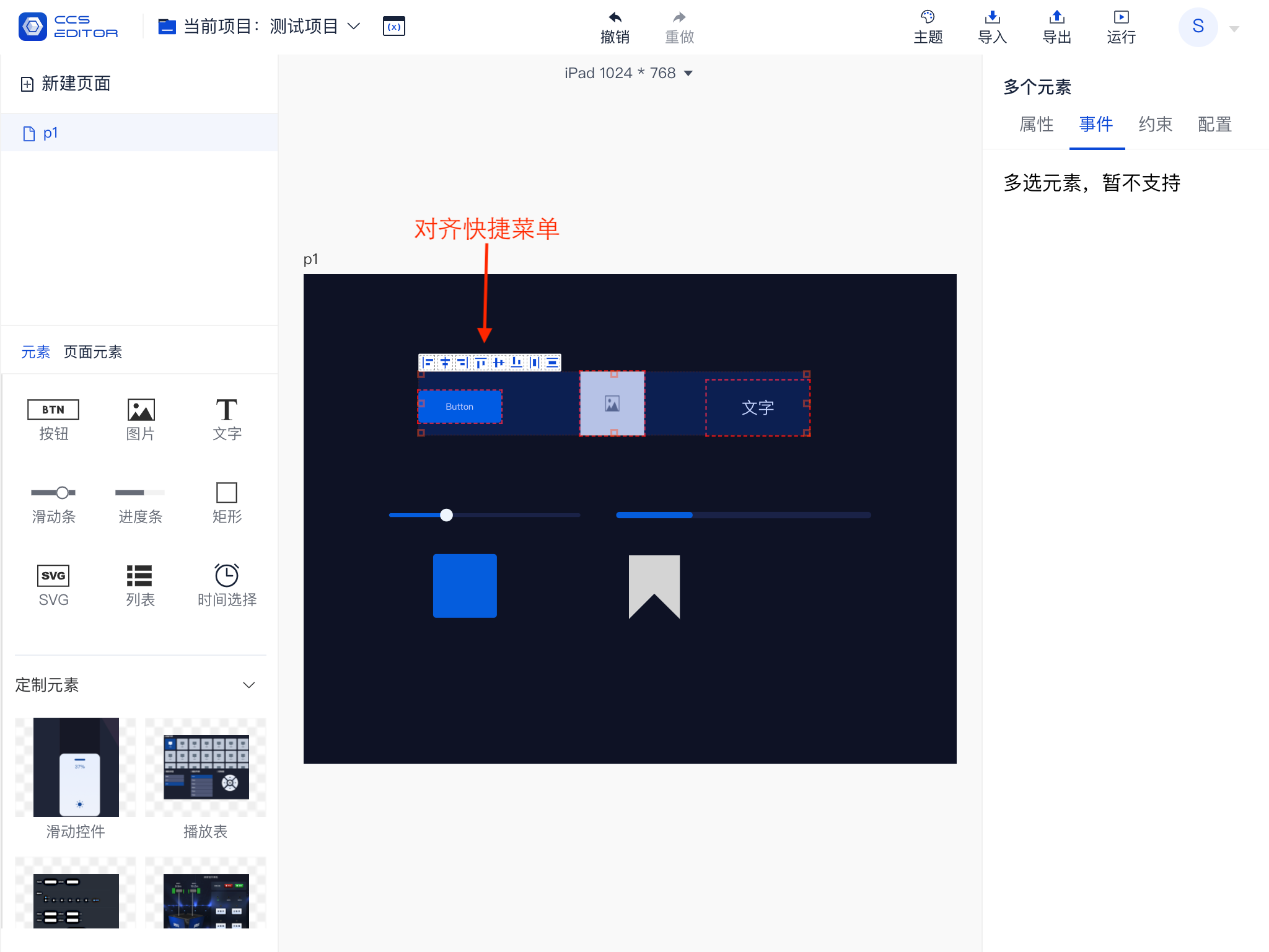
By pressing the left mouse button and dragging over the editing area, you will create a selection area. Elements within the selection area will be selected, and a red dotted box will appear around the selected elements. The selected elements will also be displayed in light blue in the element list as shown in the below image.
When multiple elements are selected at the same time, these selected elements will temporarily be called an element group, and you can perform alignment operations on this group.
The currently supported alignment methods include:
Left Align, Center Align Horizontally, Right Align, Distribute Horizontally, Align Top, Center Align Vertically, Align Bottom, Distribute Vertically.
# 6. Multiple Element Selection Menu
The multiple element selection menu is similar to the single selection menu. After selecting multiple elements, right-click to expand the menu. However, unlike the single selection element menu, it also includes an alignment option, allowing for quick alignment of multiple elements.
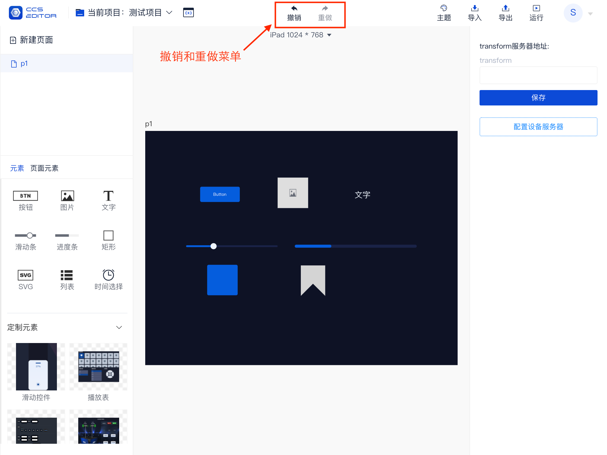
# 7. Undo and Redo
All edited content on the page, including but not limited to adding elements, deleting elements, moving elements, changing styles, adding events, and adding constraints, will be recorded. Currently, a maximum of 50 operations can be recorded on a page. You can undo to a previous recorded state or redo to restore the effect of an undo.
When buttons can execute operations, they are displayed in black; when unable to operate, they appear in gray.
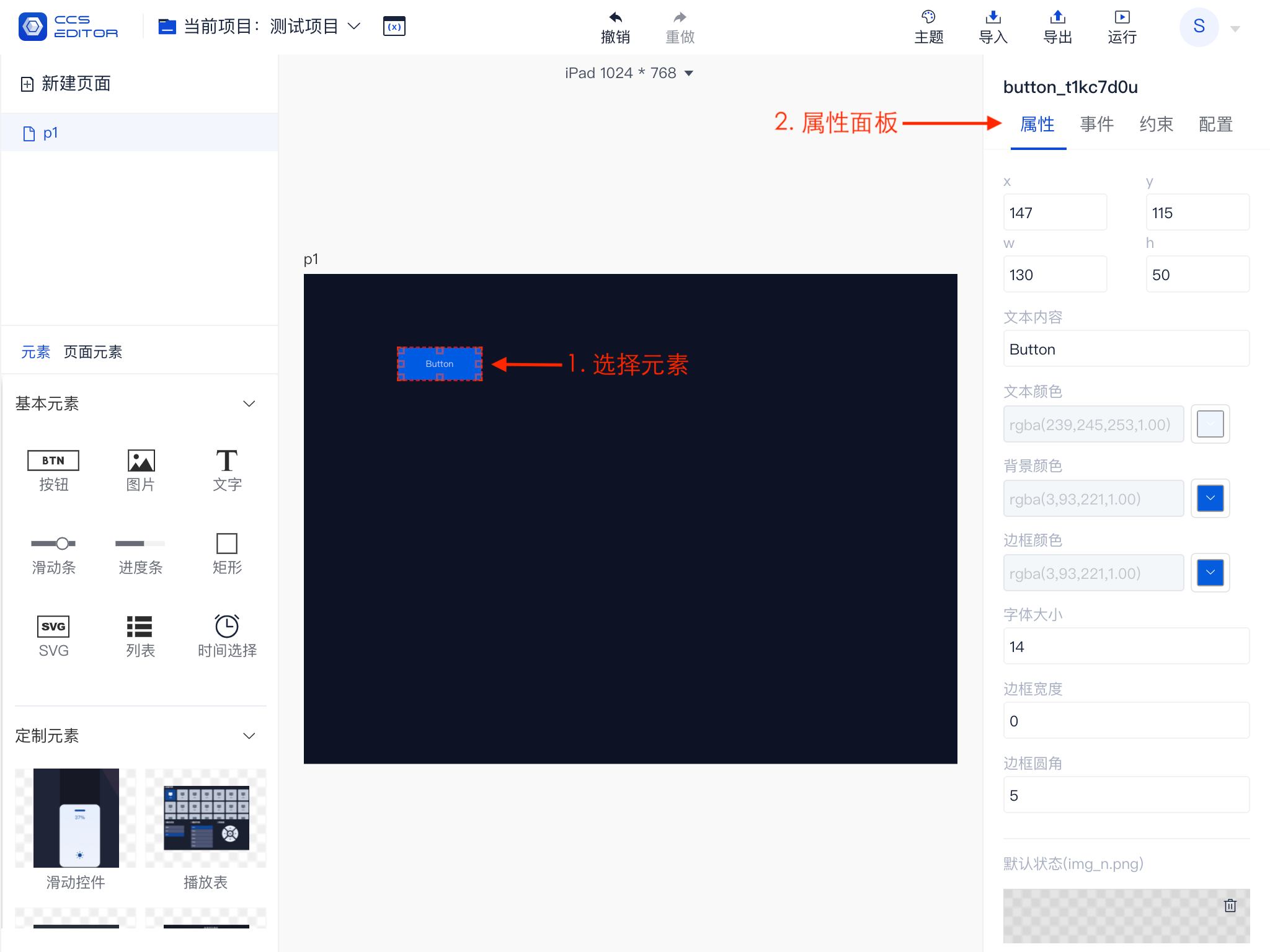
# Properties
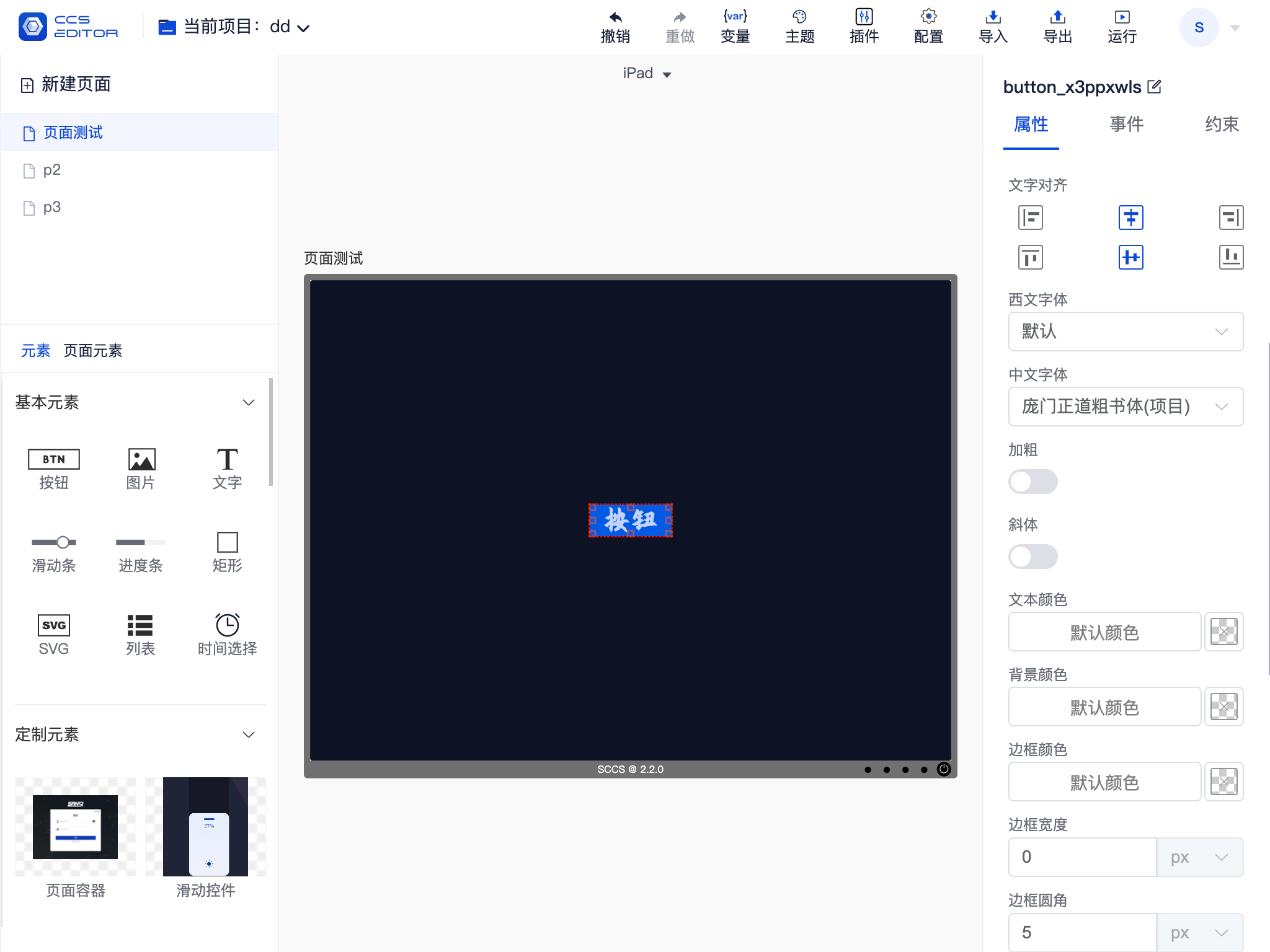
Each element has its own property information, which can be adjusted to change its display state, including but not limited to the element's size, position, color, etc.
As shown in the figure, this is the property panel for a button element. The properties that different elements can adjust vary, which may be dynamically adjusted according to the software version. Thus, refer to the software's actual running results for specific adjustable information.
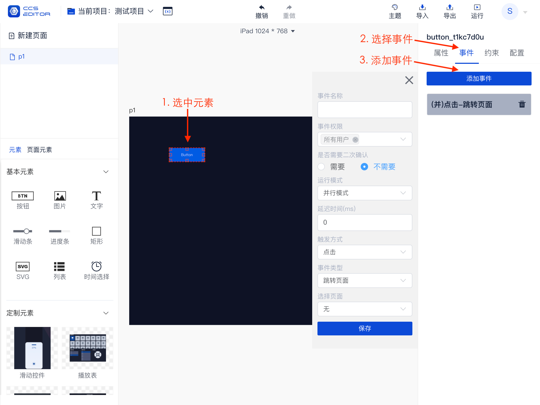
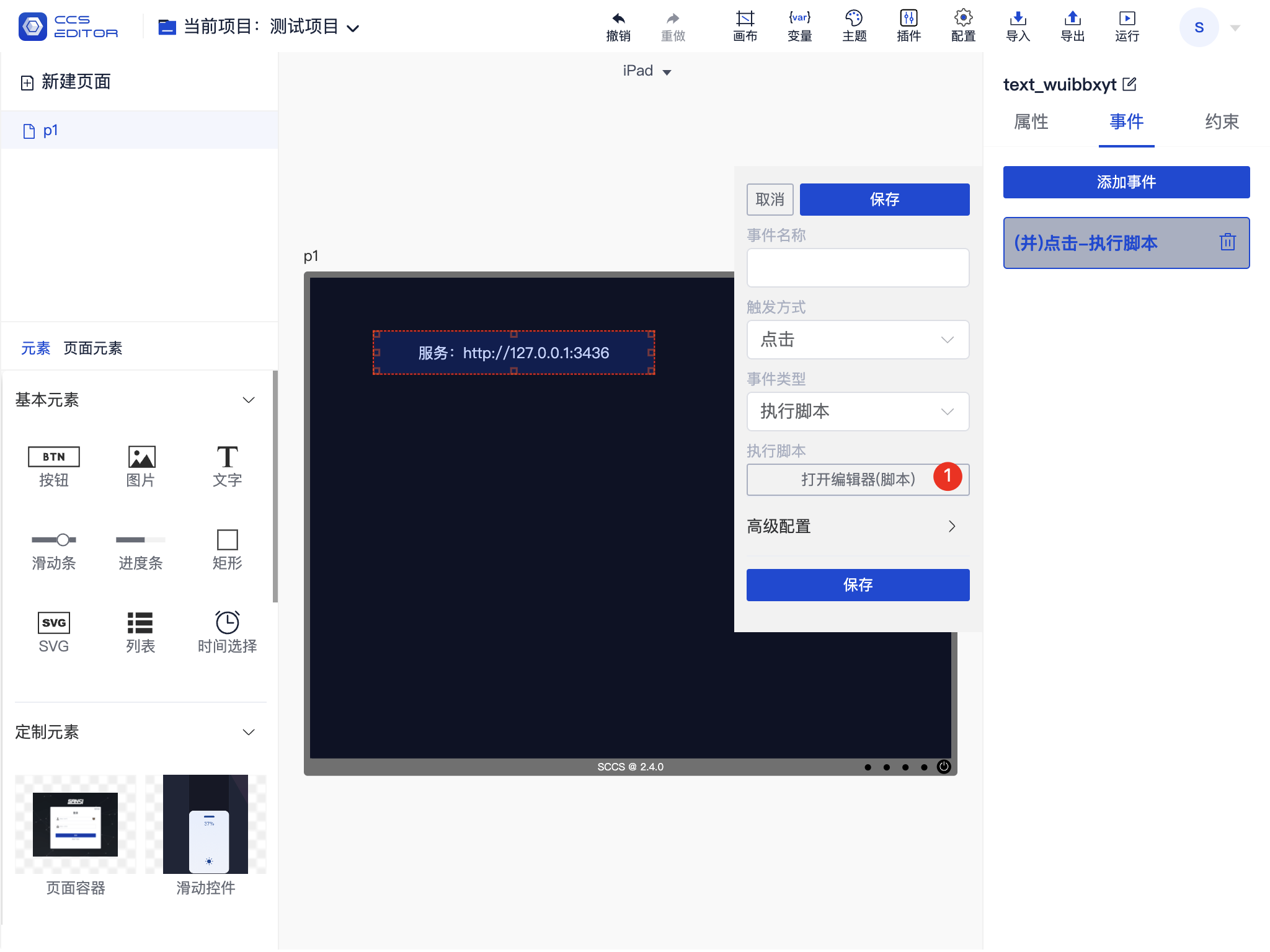
# Events
The display effects of elements can be configured through properties, but to give functions to elements, such as: closing the screen by clicking, events need to be configured for the elements. Note that each element can add multiple events.
As shown in the figure, this illustrates the process of adding a new event:
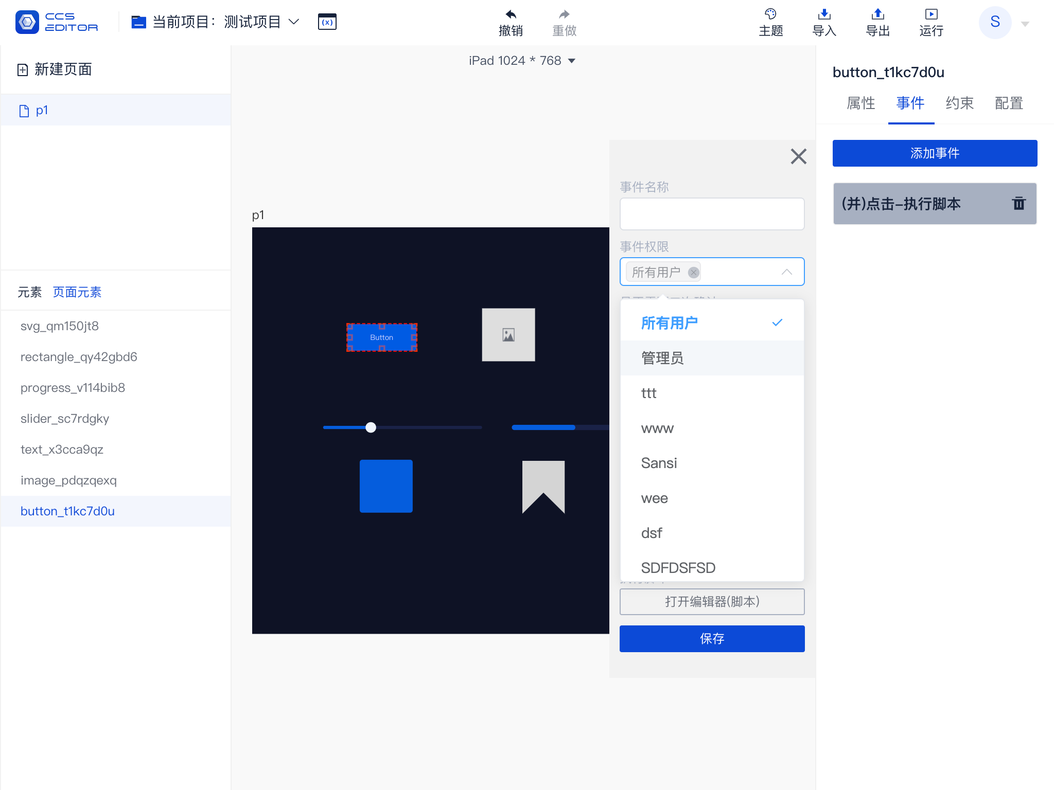
# Event Permissions
You can use the event permission selection box to add control over permissions for event execution. By default, all users can execute it; you can choose to limit it to administrators or specify a specific user.
Note:When specifying a particular user, remember to remove the permissions for all users.
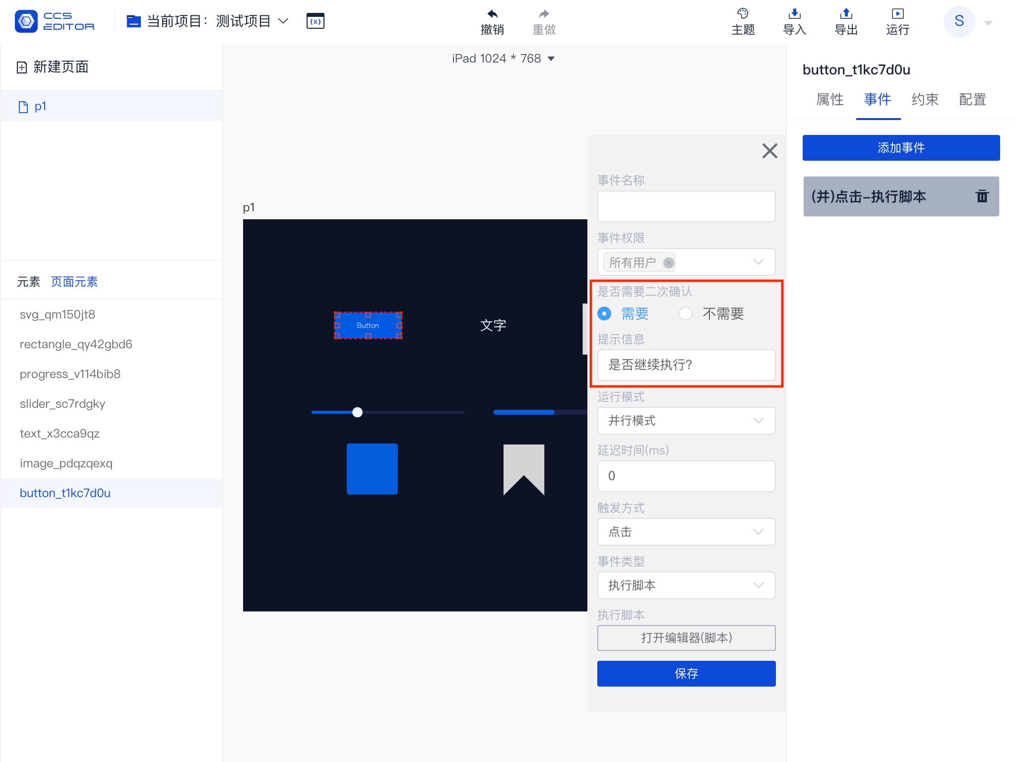
# Double Confirmation
For critical events, such as shutting down screens or systems, you can configure double confirmation to prevent accidental triggers.
# Serial and Parallel
Assuming the following event sequence:
- HTTP (Serial)
- TCP1 (Serial)
- TCP2 (Parallel)
- TCP3 (Serial)
- TCP4 (Parallel)
The actual running sequence is as follows:
HTTP -> TCP1 TCP2 -> TCP3 TCP4
Each parallel serves as a starting point. The sequencing allows for adjustments to the combination of parallel and serial strategies.
Implementation Principle
- When triggering an event, all events are traversed to obtain the events that should be triggered.
- Events in the event list are grouped based on their serial and parallel information, regrouping whenever a parallel is encountered.
- Events in each group are executed serially, with groups executing in parallel.

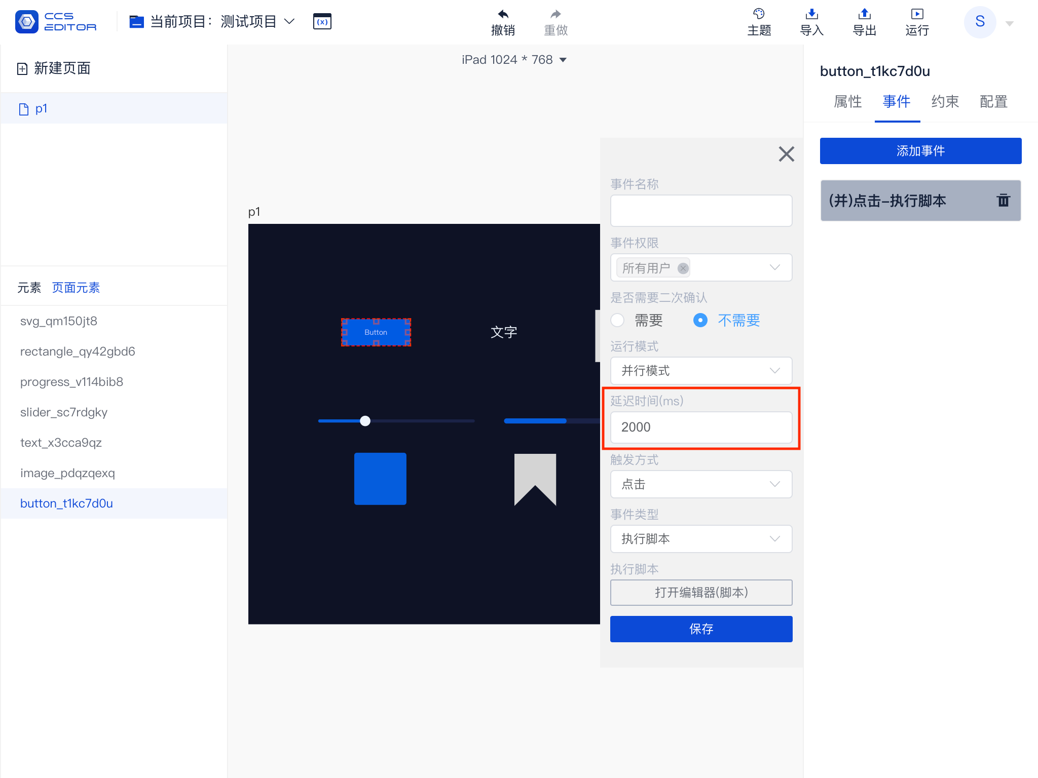
# Delayed Trigger
Events can be set with a delayed trigger time, measured in milliseconds (ms); 1 second = 1000 milliseconds. For example, to trigger after a delay of 2 seconds, input 2000.
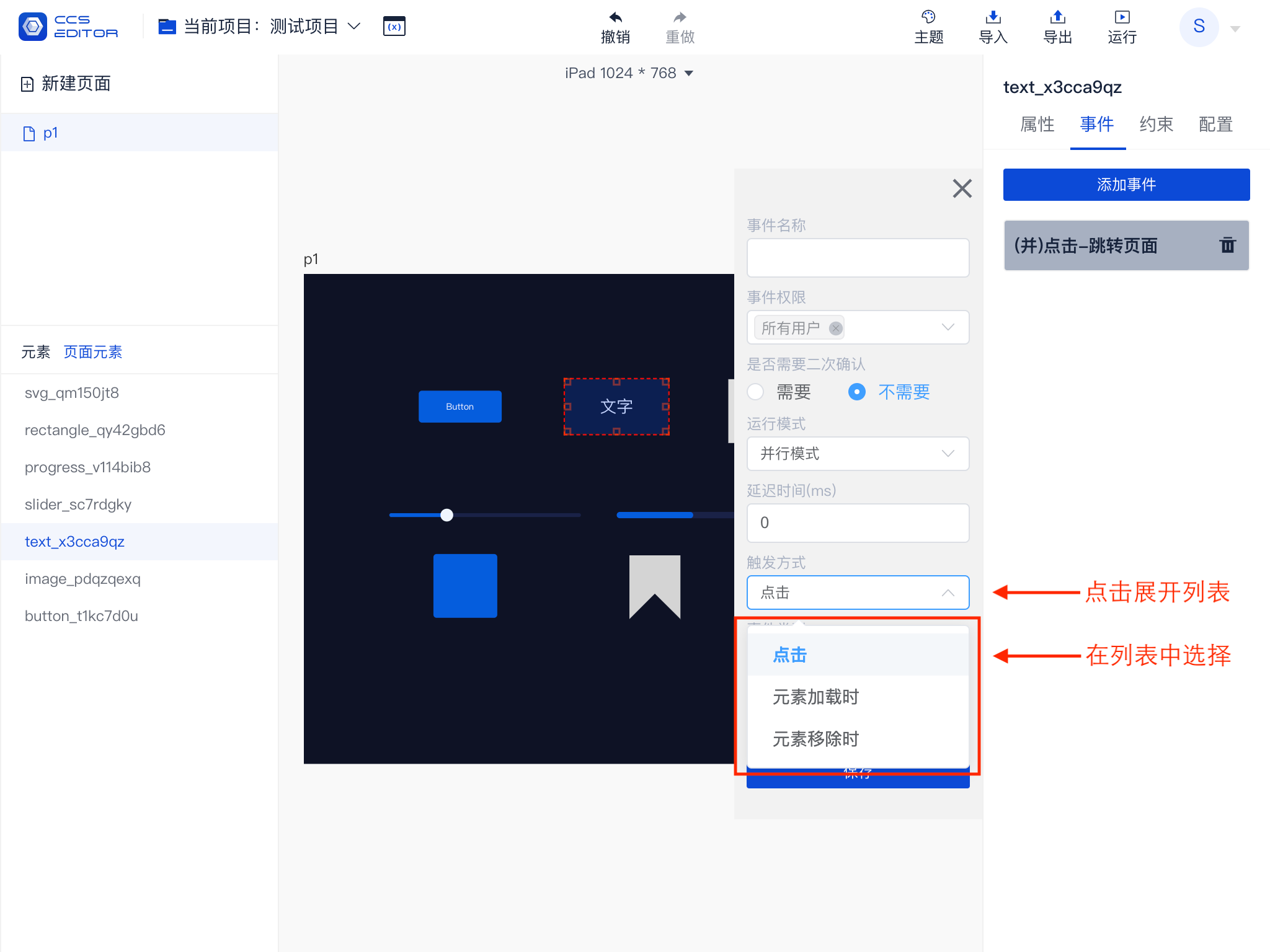
# Trigger Method
The event trigger method defines the conditions under which the event will be executed. All elements share common trigger types: 【When the Element Loads】 and 【When the Element is Removed】. In addition to these, different elements will have extra trigger types; for example, clickable elements will have 【Click】, sliders and date pickers will have 【Value Change】, and lists will have 【Item Clicked】. The existing trigger methods are as follows:
| Trigger Method | Summary |
|---|---|
| When the Element Loads | Called when the element is loaded and displayed on the page. |
| When the Element is Removed | Called when the element is removed from the page. |
| Click | Called when the element is clicked. |
| Value Change | Called when the element's value changes. |
| Item Clicked | Called when a sub-item of the element is clicked. |
Event triggers can be adjusted based on trigger methods, as shown in the figure below:
# Event Types
Currently, there are five types of events, executing different operations based on different types.
| Event Type | Summary |
|---|---|
| Jump to Page | Jump from one page in the project to another. |
| HTTP Communication | Send an HTTP request. |
| TCP Communication | Send a TCP request, requiring Transfer to forward it. |
| UDP Communication | Send a UDP request, requiring Transfer to forward it. |
| Serial Communication | Send a serial request, requiring Transfer to forward it. |
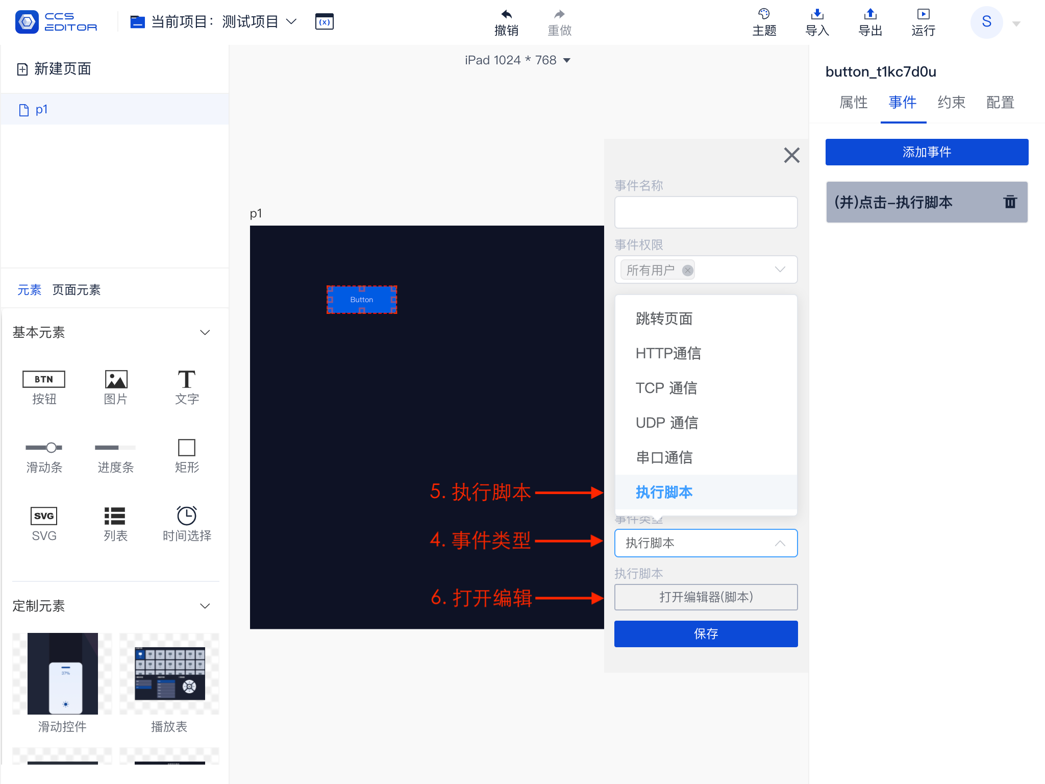
| Execute Script | Execute a script. |
Events are roughly divided into three categories: the first category is to jump to a page, the second is to perform communication, and the third is to execute scripts.
Executing scripts is a special type of event that can also perform the first two categories of events. The functionality supported by executing scripts is the most extensive, but it requires some programming knowledge; familiarity with JavaScript is preferred.
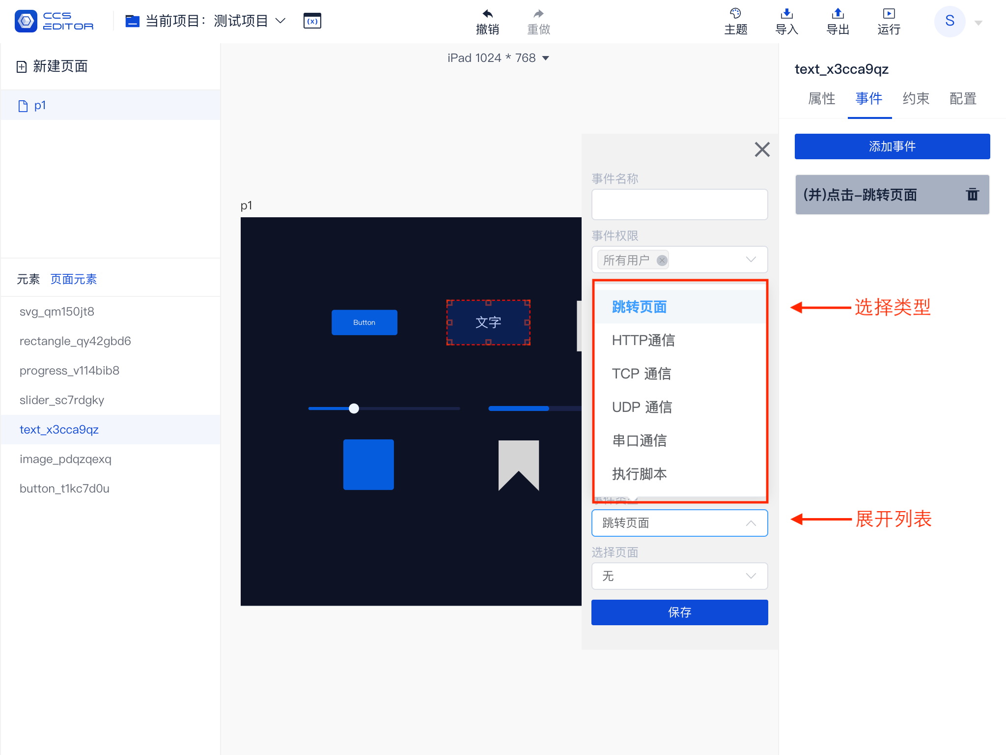
# 1 Jump to Page
Jumping to a page allows you to select a page within this project or return to the previous page.

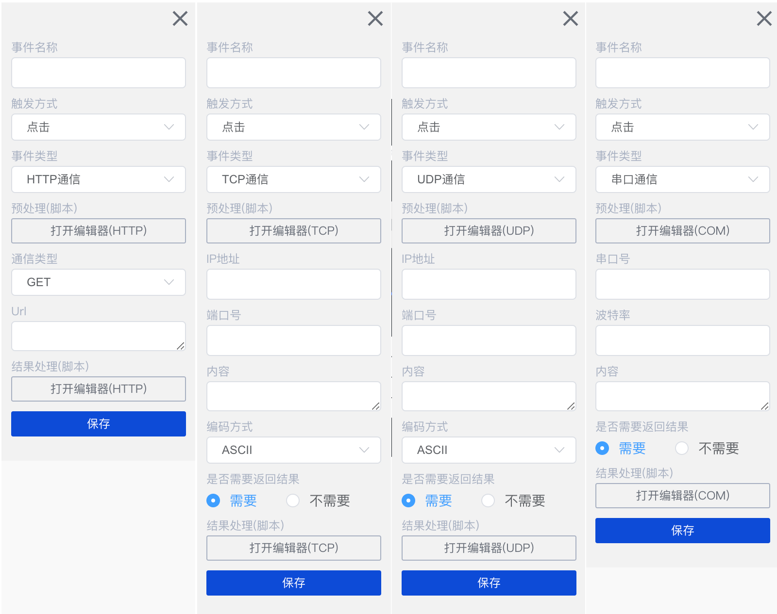
# 2 Communication
Supported communication methods include HTTP, TCP, UDP, and Serial, where HTTP communication involves direct communication between the client and the HTTP service. TCP, UDP, and Serial communication require the use of Transfer to facilitate communication, as browsers lack the ability to issue this type of communication directly.
As shown in the figure, the parameters to be configured for different communication methods can be seen. All communication methods include a 【Pre-processing (Script)】 and a 【Result Processing (Script)】, which can be used to process data before and after communication and to update the state of elements on the current page.
# 3 Script
Scripts here use JavaScript syntax, allowing users to define functional logic.
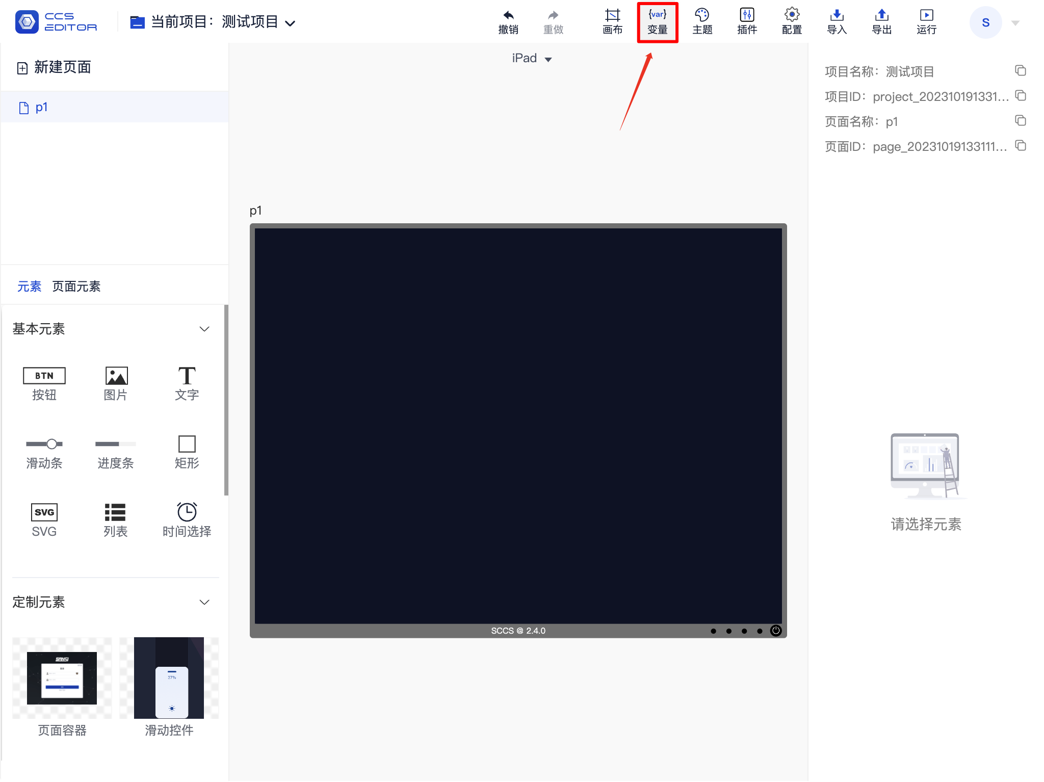
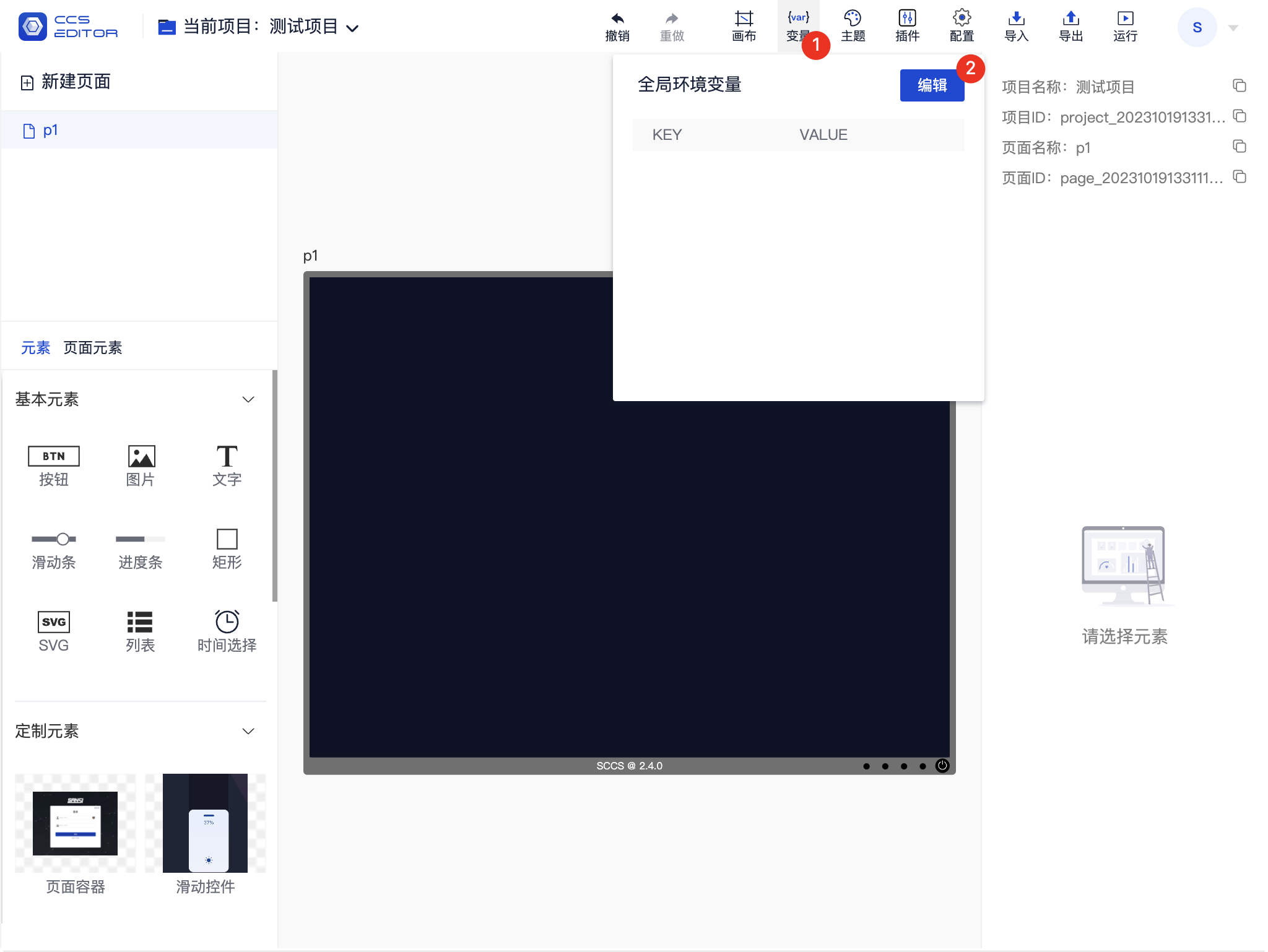
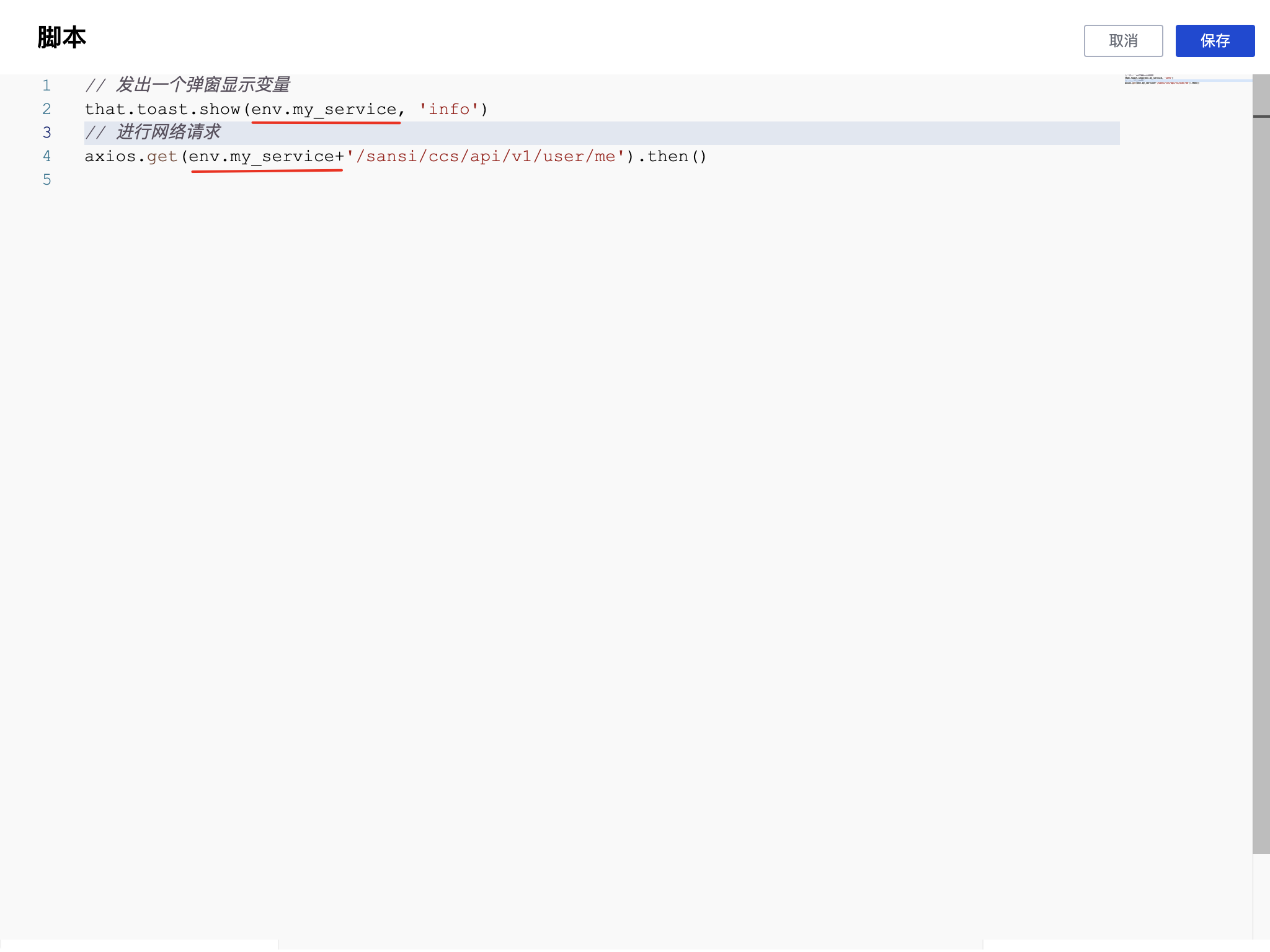
# Variables
# Variable Entry
Variables, fully named environment variables, can be used to provide global data for components within the project.
Typically used for storing some fixed public variables, such as the IP address of a service, facilitating unified modifications later.
⚠️Note: Generally, the content of this variable cannot be modified during the running phase. If you need dynamically modifiable data, please do so through interface methods.
You can adjust variables through editing functions.
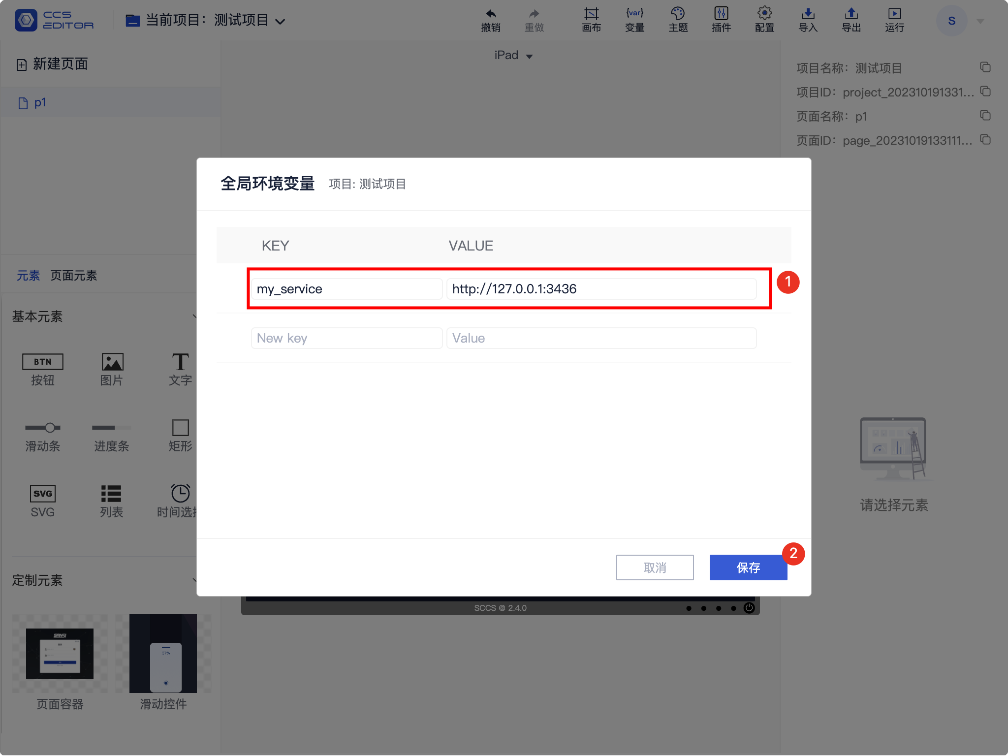
# Add Variable
After setting the key and value as shown in the figure, click save to store the variable.
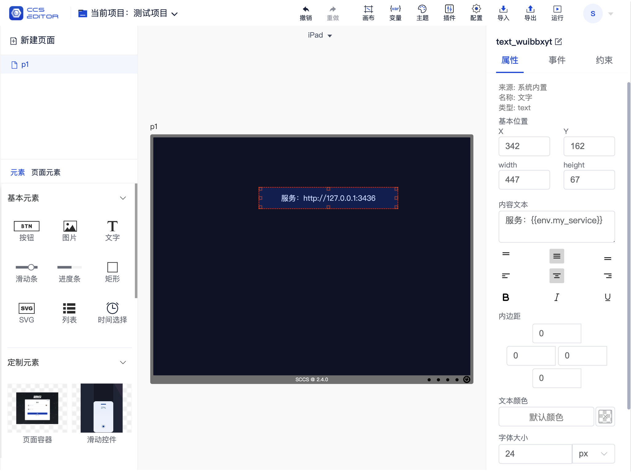
# Variable Usage
# 1. Button and Text Display Content Reference Variable
Built-in text and button components support referencing variables, but most plugin components may not support this reference.
Usage is as follows, referencing a variable with two curly braces and its name, allowing for mixing with normal text.
Text Content {{env.variable_key}}
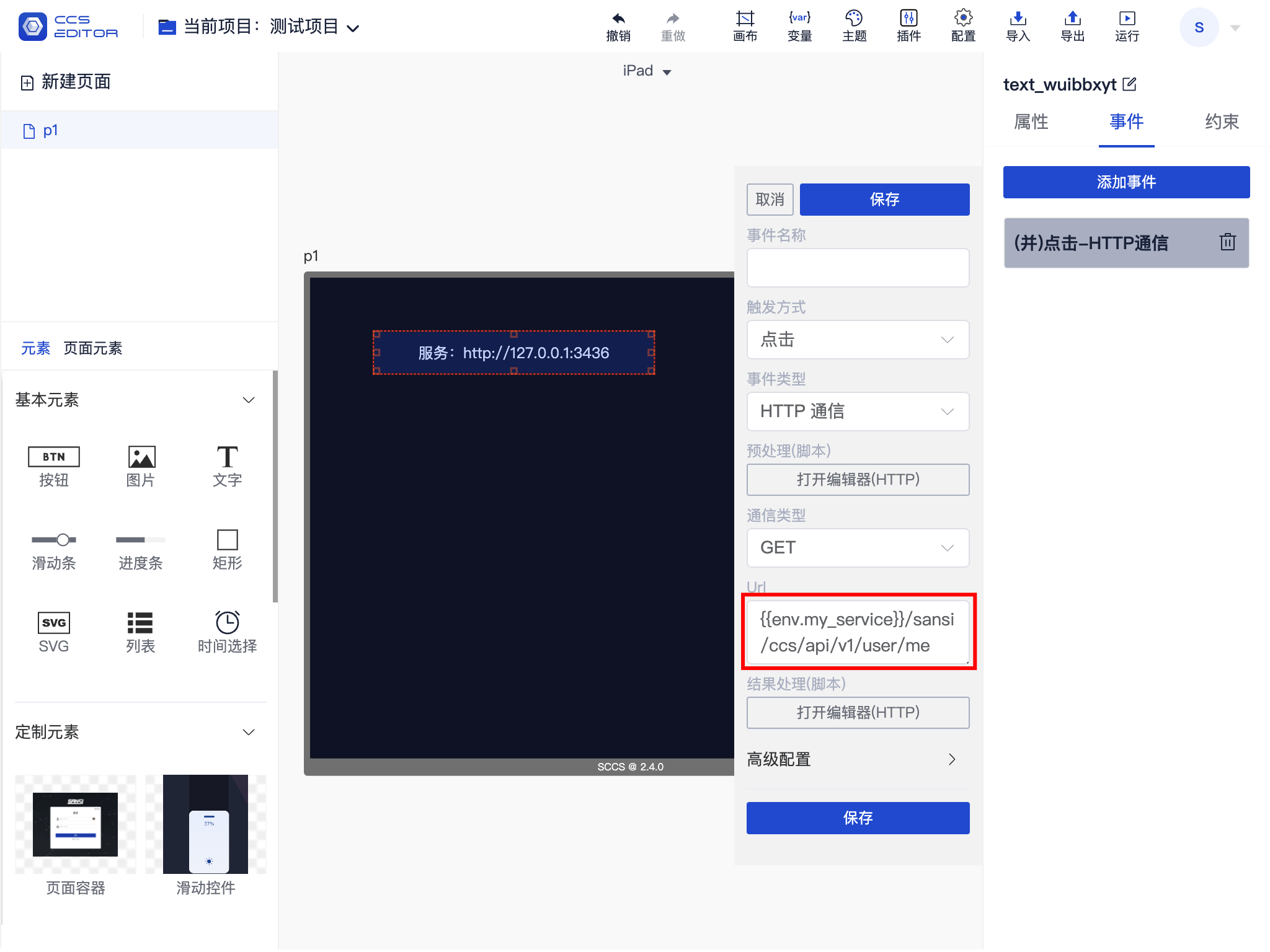
# 2. Event Reference
When adding events, you can reference service addresses from variables this way.
# 3. Script Reference
If you need to use scripts, you can use related variables within the script in the script editor.
In scripts, there is no need to use curly braces; simply use env.variable_key.
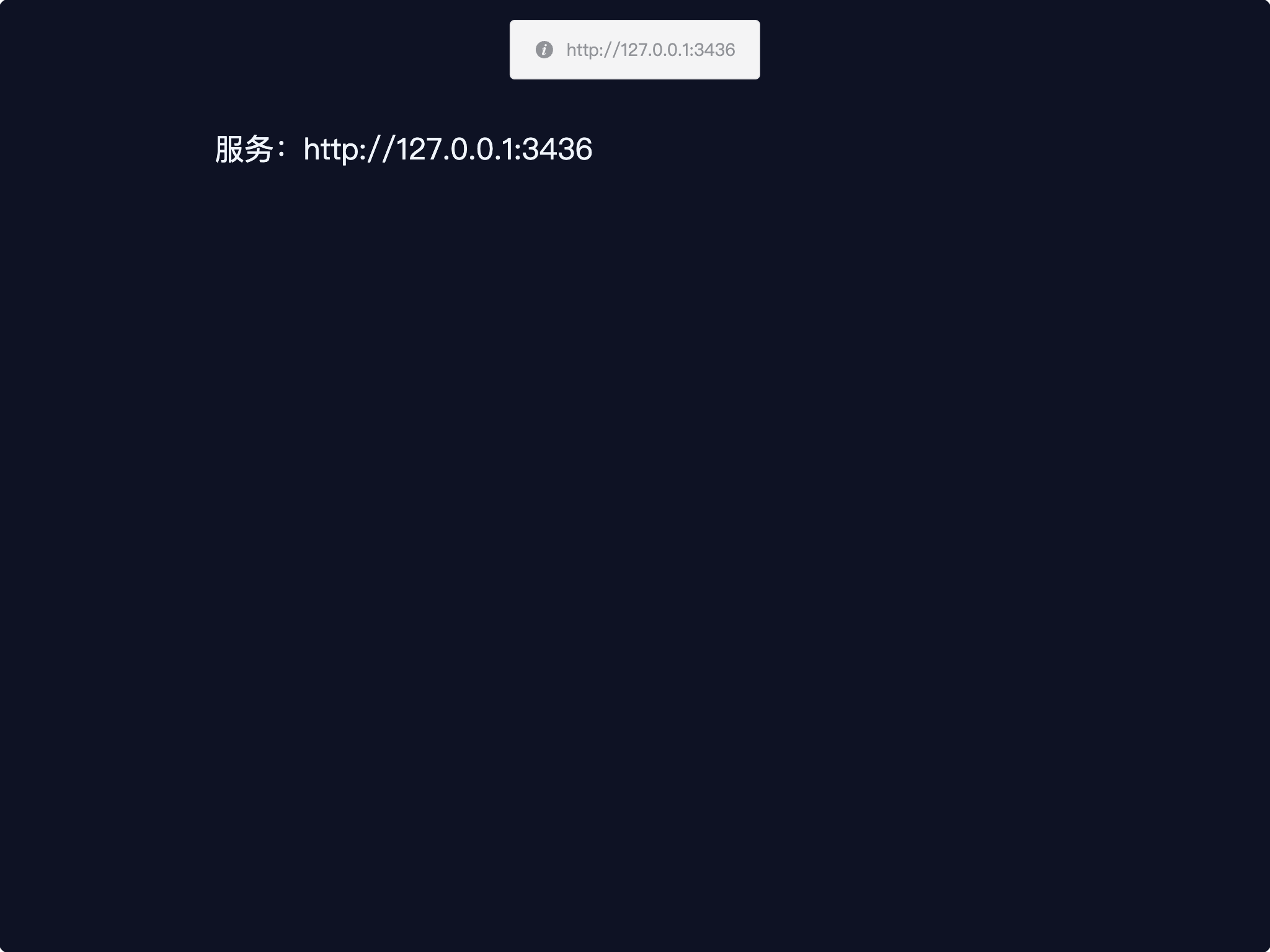
After running, the effect is shown as follows:
# Font Functionality
In versions 2.2.0 and above, font functionality is supported. The program will default to include some fonts at release, and it can also use the operating system's fonts. Font functionality is available for use in both projects and components.
# 1. Project Font
Project fonts can be set through project settings, supporting the setting of Western and Chinese fonts.
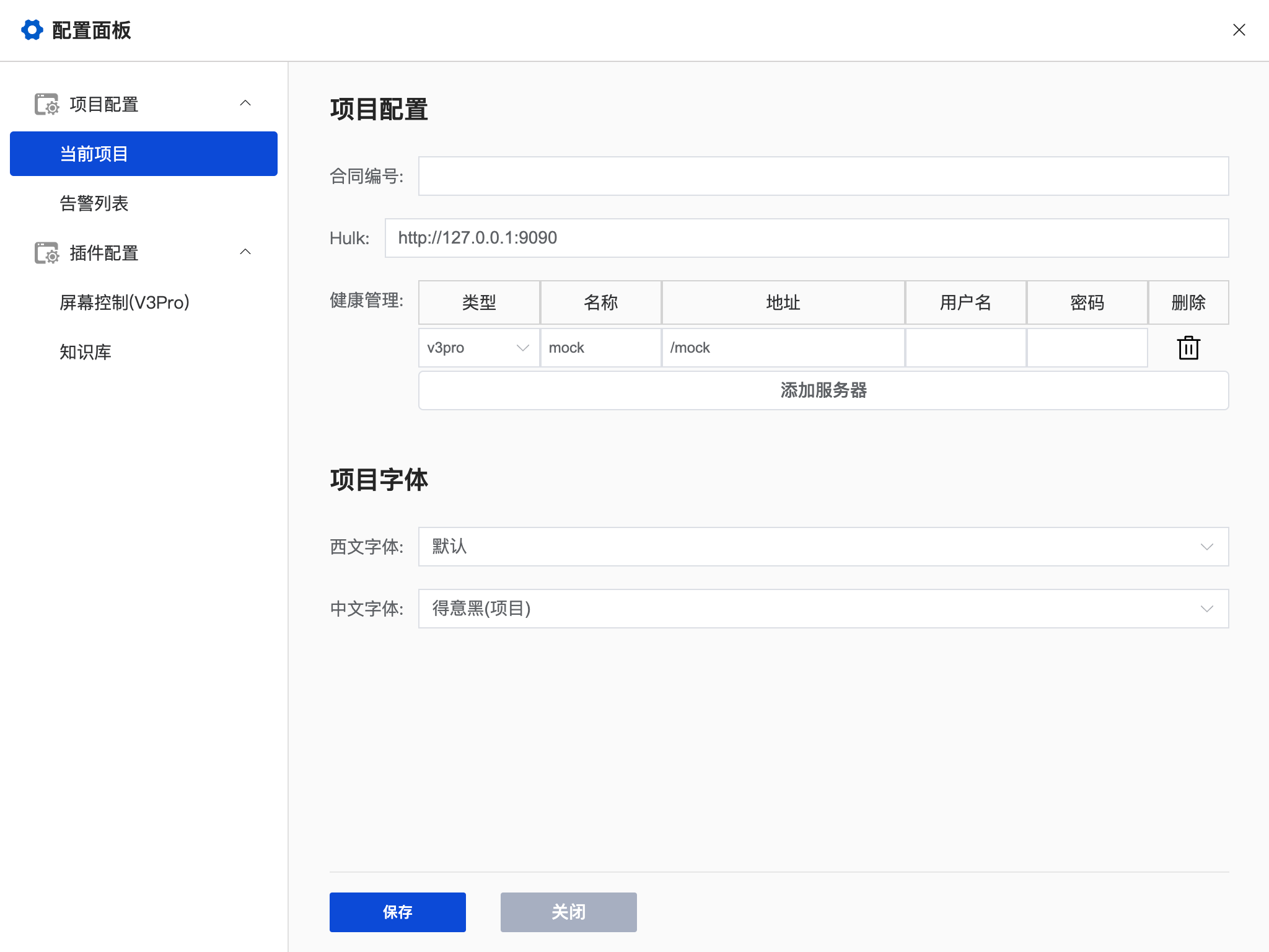
# 2. Component Font
Component fonts are similar to project fonts and can also set Western and Chinese fonts.
# 3. Notes
- By default, only setting the Chinese font is sufficient; there is no need to set the Western font separately.
- If the Western font is set to include a font format that includes Chinese, it will overwrite the Chinese format.
- System fonts are limited to those supported by the operating system; to use on another operating system, the same fonts need to be installed.
- Project fonts are stored in the
/lib/fontsdirectory under the installation directory. If you want to add fonts, you can copy the .ttf format files to this directory and then restart the service. - Many fonts have both Chinese and English font families, such as
微软雅黑andMicrosoft YaHei, which are equivalent. - If system fonts are set but have no effect when accessed on other devices, please check whether the font has been installed on the accessing device or use project fonts instead.
# Appendix One: Shortcuts
| Shortcut | Function |
|---|---|
| Ctrl + A | Select all elements on the current page |
| Ctrl + X | Cut selected elements |
| Ctrl + C | Copy selected elements |
| Ctrl + V | Paste selected elements |
| Ctrl + D | Delete currently selected elements |
| Backspace/Delete | Delete currently selected elements |
| Arrow keys (Up, Down, Left, Right) | Move currently selected elements |
| Ctrl + Z | Undo |
| Ctrl + Shift + Z | Redo |
# Appendix Two: Common Script Examples
# 1. Output Debug Information
console.log('Hello')
# 2. Get Element Properties
// Get self text property
let text1 = self.text
// Set self element text property
self.text = "替换文本"

// Get other element's text property
let text2 = that['text[0]'].text
//  Set other element's text property
that['text[0]'].text = "替换文本"
Different elements have different exposed properties; please refer to Appendix Four for details on dynamically adjustable properties.
# 3. Popup Notification
that.toast.show('Hello')
that.toast.show('Hello', 'info')
that.toast.show('Hello', 'success')
that.toast.show('Hello', 'warning')
that.toast.show('Hello', 'error')
# 4. Show Confirmation Popup
that.toast.confirm('Please Confirm').then(data => {
  // User clicked confirm
}).catch(err => {
  // User clicked cancel
})
# 5. Sending Network Requests
axios.get('/sansi/ccs/api/v1/project/projects').then(res => {
  console.log('res =', res)
  if(res.status  === 200) {
    that.toast.show('Current project count '+res.data.data.length, 'info')
  } else {
    that.toast.show('Error: '+res.message, 'error')
  }
}).catch(err => {
  that.toast.show('Error: '+err.message, 'error')
})
For more usage methods of Axios, please refer to the axios Chinese documentation (opens new window).
# 6. Script Parameters
| Parameter | Summary |
|---|---|
| params | All parameter data for the current script |
| self | Refers to the element that triggered the event |
| that | Refers to the VueComponent |
| router | Routing |
| axios | Network request interface |
# Appendix Three: Basic Elements
| Element Name | Function |
|---|---|
| Button | Provides a clickable area to trigger related events. |
| Image | Used to display images. |
| Text | Used to display text. |
| Slider | Used to adjust data through sliding, like screen brightness. |
| Progress Bar | Used to display progress information. |
| Rectangle | Used to mark a specific area. |
| SVG | Used to display SVG images. |
| List | Used to display list information. |
| Time Picker | Used to provide time selection. |
# Appendix Four: Dynamically Adjustable Properties of Elements
# 1. Common Properties
| Property | Type | Function | Parameter Example |
|---|---|---|---|
| disabled | boolean | Whether it is disabled | true, false |
| visible | boolean | Whether it is visible | true, false |
# 2. Button
| Property | Type | Function | Parameter Example |
|---|---|---|---|
| normalImageUrl | url | Default Image | /api/v1/assets/image/btn_0_n.png |
| selectedImageUrl | url | Selected Image | /api/v1/assets/image/btn_0_s.png |
| activedImageUrl | url | Active Image | /api/v1/assets/image/btn_0_a.png |
| disabledImageUrl | url | Disabled Image | /api/v1/assets/image/btn_0_d.png |
| text | String | Display Text | Button, 按钮 |
| backgroundColor | color | Background Color | #ffffff, #ccffffff |
| selected | boolean | Selected | true, false |
# 3. Text
| Property | Type | Function | Parameter Example |
|---|---|---|---|
| text | String | Display Text | Button, 按钮 |
| textColor | color | Text Color | #ffffff, #ccffffff |
| backgroundColor | color | Background Color | #ffffff, #ccffffff |
# 4. Image
| Property | Type | Function | Parameter Example |
|---|---|---|---|
| url | url | Image | /api/v1/assets/image/img.png |
| backgroundColor | color | Background Color | #ffffff, #ccffffff |
# 5. Rect
| Property | Type | Function | Parameter Example |
|---|---|---|---|
| backgroundColor | color | Background Color | #ffffff, #ccffffff |
# 6. Slider
| Property | Type | Function | Parameter Example |
|---|---|---|---|
| value | number | Current Value | 0, 50 |
# 7. Progress
| Property | Type | Function | Parameter Example |
|---|---|---|---|
| value | number | Current Value | 0, 50 |
# 8. List
| Property | Type | Function | Parameter Example |
|---|---|---|---|
| data | array | Current List Array | ["Item 1", "Item 2"] |
| clickedIndex (read-only) | number | Currently Clicked Item Index | 1 |
| clickedData (read-only) | String | Currently Clicked Item Content | "Item 1" |
| backgroundColor | color | Background Color | #ffffff, #ccffffff |
# 9. TimePicker
| Property | Type | Function | Parameter Example |
|---|---|---|---|
| value | date | Currently Selected Time | 11:17:56 |
# 10.SVG
| Property | Type | Function | Parameter Example |
|---|---|---|---|
| backgroundImage | url | Background Image | /api/v1/assets/image/bg.png |
| backgroundColor | color | Background Color | #ffffff, #ccffffff |