# Plugin Specification
⚠️Note: For creating a default example project, please refer toInitialize Project
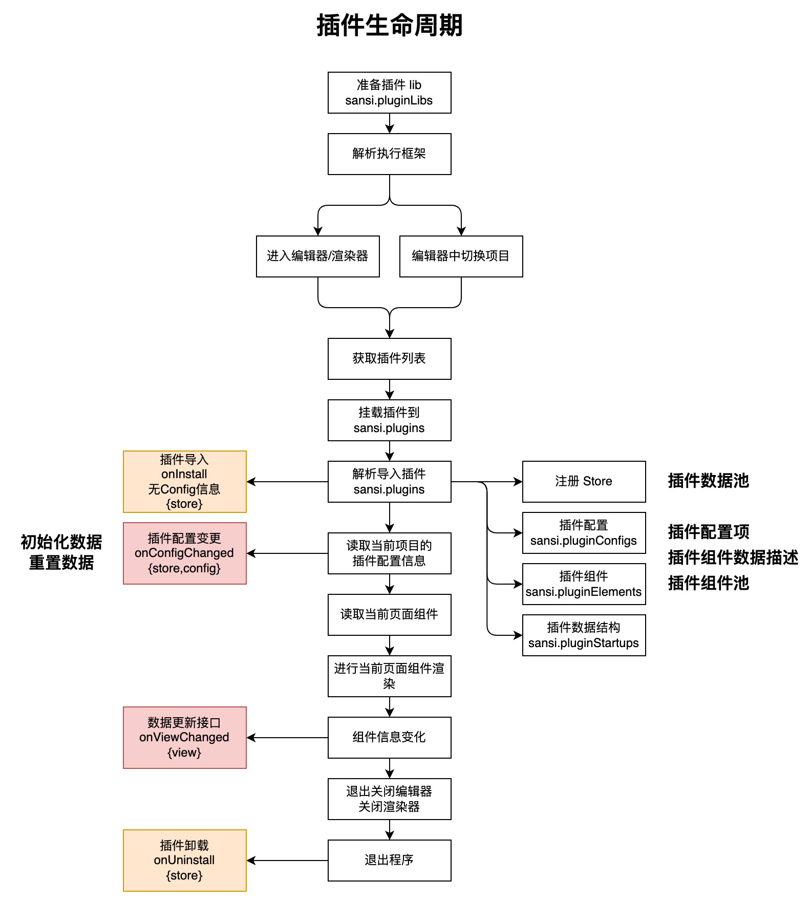
# Lifecycle
# Directory Structure
The directory structure for plugin development projects is as follows:
.
├── main.json  (Plugin description file)
├── public (Public directory)
│   └── icon.png (Plugin icon)
├── src
│   ├── index.ts (Project entry point)
│   ├── views
│   │   ├── PowerButton.vue (Plugin example)
│   │   ├── CustomAttrsParserDemoView.vue (Example of a custom plugin parser)
│   │   └── assets  (Resource directory)
│   │       ├── btn_off.webp
│   │       └── btn_on.webp
│   ├── attrs
│   │   └── Switch.vue (Custom plugin parser)
│   ├── config
│   │   ├── index.ts  (Plugin configuration declaration)
│   │   └── components
│   │       └── Servers.vue (Custom configuration component (can be deleted))
│   ├── hooks
│   │   └── useVuex.ts  (Vuex helper)
│   ├── locales (Internationalization translation, requires ccs-pro 2.1.0+ and sccs 0.4.0+)
│   │   ├── en.js  (English translation)
│   │   ├── zh_CN.js  (Chinese translation)
│   │   └── i18n.ts  (Internationalization translation helper)
│   ├── store
│   │   └── index.ts  (Vuex store)
│   ├── global.d.ts (Data structure definitions)
│   └── vue.d.ts    (Data structure definitions)
├── package.json (Project description file)
└── tsconfig.json (TS configuration)
# Key Files/Directories Description
| File/Directory | Type | Description |
|---|---|---|
| main.json | File | Plugin description file, used to declare plugin ID, name, version, description, icon, entry, style, and other relevant information. |
| public/ | Directory | Public directory for storing common resource files; defaults to placing an icon file. |
| src/ | Directory | Project directory containing relevant code and resources. |
| src/index.ts | File | Plugin entry point, used to declare and register relevant components, data, configurations, and receive lifecycle callbacks. |
| src/views/PowerButton.vue | File | Default example component. |
| src/views/CustomAttrsParserDemoView.vue | File | Example for using the plugin parser. |
| src/views/assets/ | Directory | Resource file directory; can be modified to other locations. |
| src/attrs/Switch.vue | File | Plugin parser example. |
| src/config/index.ts | File | Plugin configuration declaration. |
| src/config/components/ | Directory | Custom configuration visual components, used for parsing unsupported default types. |
| src/store/index.ts | File | Plugin data pool (Vuex). |
| src/hooks/useVuex.ts | File | Vuex wrapper for the plugin to handle related data in the plugin data pool. |
| src/global.d.ts | File | Data structure definitions, usually no adjustment is necessary. |
| src/vue.d.ts | File | Data structure definitions, usually no adjustment is necessary. |
| package.json | File | Project description file. |
| tsconfig.json | File | TS configuration. |
| src/locales/ | Directory | Internationalization translation files (requires ccs-pro 2.1.0 and sccs 0.4.0 or above) |
| src/locales/i18n.ts | File | Internationalization translation helper (requires ccs-pro 2.1.0 and sccs 0.4.0 or above) |
| src/locales/en.js | File | English translation file (requires ccs-pro 2.1.0 and sccs 0.4.0 or above) |
| src/locales/zh_CN.js | File | Chinese translation file (requires ccs-pro 2.1.0 and sccs 0.4.0 or above) |
# Description File
The basic description information in the plugin structure is main.json, its basic structure is as follows:
{
  "id": "demo",
  "version": "1.0.0",
  "icon": "icon.png",
  "name": "Unnamed Plugin",
  "description": "Default Description",
  "entry": [
    "index.js"
  ],
  "style": [
    "index.css"
  ]
}
# Description File Fields
| Field | Type | Description |
|---|---|---|
| id | string | Unique identifier for the plugin, can be automatically generated at project initialization or manually specified. |
| version | string | lugin version number,be sure to modify this version number when a new version of the plugin is released。 |
| icon | string | Plugin icon. |
| name | string | Plugin name. |
| description | string | Plugin description. |
| entry | string[] | Plugin entry points, generally should remain default. |
| style | string[] | Plugin stylesheet, generally should remain default. |
# Plugin Entry
The overall entry for the plugin is index.ts
import PowerButton from './views/PowerButton.vue';
import CustomAttrsParserDemoView from './views/CustomAttrsParserDemoView.vue';
import Switch from './attrs/Switch.vue'
import { Store } from 'vuex';
import config from '@/config';
import store from '@/store';
import main from '@main';

export default {
  ...main,
  elements: [PowerButton, CustomAttrsParserDemoView],
  // Custom plugin attribute parser (can be deleted)
  attrsComponents: { 'plg-switch': Switch },
  // Plugin data pool (can be deleted)
  stores: [store],
  config: config,
  // Called when importing the plugin
  onInstall({ store }: { store: Store<any> }) {},
  // Called when uninstalling the plugin
  onUninstall(_: { store: Store<any> }) {},
  // Called when configuration changes
  onConfigChanged({ config, store }: { config: any; store: Store<any> }) {
    store.commit(main.id + '#store/setPrefix', config.prefix);
  },
};
⚠️Note: The use of
...mainin the export is to uniformly use the fields defined inmain.jsonand generally, it should remain unchanged.
# Plugin Entry Fields
| Field | Description |
|---|---|
| elements | Components of the plugin, displayed in the component panel and can be added to the page, must comply with the[Plugin Component Specification](#Plugin Component Specification)。 |
| attrsComponents | Custom component attribute parsers, used in the component's property panel and must comply with the[Plugin Custom Attribute Parser Specification](#Plugin Custom Attribute Parser Specification) |
| stores | Plugin data pool, automatically registered upon plugin loading and must comply with the[Plugin Data Pool Specification](#Plugin Data Pool Specification)。 |
| config | Plugin configuration, supports custom data parsers and must comply with the[Plugin Configuration Specification](#Plugin Configuration Specification)。 |
| onInstall | Callback during plugin loading; details can be found inLifecycle。 |
| onUninstall | Callback during plugin unloading; details can be found in Lifecycle。 |
| onConfigChanged | Callback interface during plugin configuration loading/changing; details can be found in Lifecycle。 |
# Plugin Data Pool Specification
⚠️Note:
The plugin data pool is non-mandatory. If needed, please adhere to the Vuex specification. If not required, it can be removed.
Of course, other data transfer methods such as provider & inject and custom hooks can also be used for data sharing.
/src/store/index.ts
export default {
  name: 'store',
  namespaced: true,
  state: {
    power: 'off',
    prefix: '',
  },
  getters: {},
  mutations: {
    changePower: (state, { power }) => {
      state.power = power;
    },
    setPrefix: (state, prefix) => {
      state.prefix = prefix;
    },
  },
  actions: {
    switchPower: ({ state, commit }) => {
      // Here you can communicate with the server to sync status
      if (state.power === 'on') {
        commit('changePower', { power: 'off' });
      } else {
        commit('changePower', { power: 'on' });
      }
    },
  },
};
The data pool generally follows the Vuex 4.x specification. For details, please refer to vuex (opens new window),It should be noted that the exported data pool should include the name property, which is important for subsequent use.
# Plugin Component Specification
The following are the basic format requirements for components. Compared to standard Vue components, a startup property must be exported and comply with plugin requirements.
<template>
  <div style="width: 100%; height: 100%; background-color: red"></div>
</template>

<script lang="ts" setup>
// Write Vue 3 logic code here
</script>
<script lang="ts">
export default {
  startup: {
    title: 'Test View',
    icon: '',
    init: {
      type: 'demo-view',
      props: {
        frame: { y: 0, x: 0, width: 100, height: 100 },
        attrs: {},
      },
    },
    schema: {
      attrs: [],
    },
  },
};
</script>
# Description of the startup Field
| Field | Type | Description |
|---|---|---|
| title | string | Display name of the plugin. |
| icon | string | Preview icon of the plugin. |
| init | object | Initialization structure of the plugin. |
| init.type | string | Plugin type,not be duplicated with other components' types in the plugin. |
| init.props | object | Properties of the plugin. |
| init.props.frame | object | Default size of the plugin. |
| init.props.attrs | object | Custom configurable attributes of the plugin, displayed in the attributes panel on the right side of the editor. |
| schema | object | Attribute auxiliary interpreter. |
| schema.attrs | object | Attribute auxiliary interpreter for attrs. |
For the specification of customizable attrs in the plugin, please refer to[Appendix I: Definition of Editable Attributes Format](#Appendix I: Definition of Editable Attributes Format)
For a more complete example of a plugin component, please refer to [Appendix II: Complete Plugin Component Example](#Appendix II: Complete Plugin Component Example)
You can also create a project using the sccs tool and refer to the example components within it.
# Plugin Configuration Specification
Plugin configuration is a way to declare plugin configuration properties. The configuration information declared by the plugin will be presented in a visual form in the plugin's configuration menu. A default plugin configuration looks like this:
⚠️Note: Custom parsers can be omitted; if there is no requirement, you can use the default parser directly without providing a custom parser.
import Servers from "./components/Servers.vue";

// Original config data
const data: any = {
  prefix: "插件配置",
  myColor: "",
  servers: [
    {
      type: "server",
      url: "http://127.0.0.1:12409",
      username: "",
      password: ""
    }
  ]
};

// 数据结构声明
const schema: any = [
  {
    component: "card",
    props: {
      header: "Basic Information"
    },
    formProps: {},
    fields: [
      {
        name: "prefix",
        component: "input",
        formProps: {
          label: "Prefix:"
        },
        inputProps: {}
      },
      {
        name: "myColor",
        component: "color-picker",
        formProps: {
          label: "Color:"
        },
        inputProps: {}
      },
      {
        name: "servers",
        component: "servers",
        formProps: {
          label: "Server Address:"
        },
        inputProps: {}
      }
    ]
  }
];

// Custom data parser
const components = {
  servers: Servers
};

// Export related information
export default {
  data,
  schema,
  components
};
Custom parser (optional):
<template>
  <div>
    <div v-if="!props.modelValue || !Array.isArray(props.modelValue)" style="color: red">Data type error</div>
    <div v-else-if="props.modelValue.length <= 0">
      <ElButton style="width: 100%" @click="addServer">Add Server</ElButton>
    </div>
    <template v-else>
      <div class="header">
        <span style="width: 40%">Server Address</span>
        <span style="width: 25%">Username</span>
        <span style="width: 25%">Password</span>
        <span style="width: 10%">Delete</span>
      </div>
      <div v-for="(model, index) of props.modelValue" style="width: 100%; padding: 1px 0">
        <ElInput v-model="model.url" style="width: 40%" size="small"></ElInput>
        <ElInput v-model="model.username" style="width: 25%" size="small"></ElInput>
        <ElInput v-model="model.password" style="width: 25%" size="small"></ElInput>
        <icon name="delete" width="10" height="22" style="width: 10%" class="delete" @click="del(index)"></icon>
      </div>
      <ElButton style="width: 100%" @click="addServer">Add Server</ElButton>
    </template>
  </div>
</template>

<script setup lang="ts">
import { ElButton, ElInput } from "element-plus";

const props = defineProps(["modelValue", "options"]);
const defaultOptions = [{ label: "v3pro", value: "v3pro" }];
const options = props.options || defaultOptions;

function addServer() {
  props.modelValue.push({
    url: "",
    username: "",
    password: ""
  });
}

function del(index: number) {
  props.modelValue.splice(index, 1);
}
</script>

<style scoped lang="less">
.header {
  width: 100%;

  span {
    padding: 1px;
    display: inline-block;
    text-align: center;
    border: #d3d3d3 1px solid;
  }
}

.delete {
  color: black;

  &:hover {
    color: red;
  }
}
</style>
Default parser types:
| component | Supported Field Properties | Description |
|---|---|---|
| input | string | Text input box |
| image | string | Image selector |
| select | string | Content selector (single selection) |
| switch | boolean | Toggle button |
| date-picker | string | Date selector |
| time-picker | string | Time selector |
| color-picker | string | Color selector |
| rate | number | Rating |
# Plugin Custom Attribute Parser Specification
# 1. Define Parser
Custom attribute parsers are essentially Vue components, and if you want to customize an attribute parser, you can define it as follows. The raw data is passed in through modelValue , and if the data is updated, it is sent out through update:modelValue.
The attribute parser is responsible for data parsing display and sending update notifications after editing. The attribute parser does not need to know the specific source and field names of the data. For instance, the following parser is essentially a switch component that receives boolean-type data.
src/attrs/Switch.vue
<template>
  <div>
    <el-switch :model-value="props.modelValue" v-bind="$attrs" @change="changed"></el-switch>
  </div>
</template>

<script setup lang="ts">
const props = defineProps(['modelValue']);
const emit = defineEmits(['update:modelValue']);
const changed = (val: boolean) => emit('update:modelValue', val);
</script>
# 2. Declare Parser
Once the parser is defined, it needs to be declared at the entry point of the plugin to be used, as shown below:
src/index.ts
import PowerButton from './views/PowerButton.vue';
import CustomAttrsParserDemoView from './views/CustomAttrsParserDemoView.vue';
import Switch from './attrs/Switch.vue'
import { Store } from 'vuex';
import config from '@/config';
import store from '@/store';
import main from '@main';

export default {
  ...main,
  elements: [PowerButton, CustomAttrsParserDemoView],
  // Note here, declaring custom plugin attribute parsers
  attrsComponents: { 'plg-switch': Switch },
  stores: [store],
  config: config,
  onInstall({ store }: { store: Store<any> }) {},
  onUninstall(_: { store: Store<any> }) {},
  onConfigChanged({ config, store }: { config: any; store: Store<any> }) {
    store.commit(main.id + '#store/setPrefix', config.prefix);
  },
};
# 3. Using the Parser
To use the parser, you need to specify the declared custom parser in startup.schema.attrs[i].component .
src/views/CustomAttrsParserDemoView.vue
<template>
  <div style="width: 100%; height: 100%" :style="myStyle"></div>
</template>

<script lang="ts" setup>
import { computed } from 'vue';

const props = defineProps(['view']);
const attrs = computed(() => props.view.props.attrs || {}); // attrs 属性
const myStyle = computed(() => {
  return attrs.value.red ? { backgroundColor: 'red' } : { backgroundColor: 'blue' };
});
</script>

<script lang="ts">
export default {
  startup: {
    title: '测试View',
    icon: '',
    init: {
      type: 'demo-view',
      props: {
        frame: { y: 0, x: 0, width: 100, height: 100 },
        // 定义属性
        attrs: {
          red: false,
        },
      },
    },
    schema: {
      attrs: [
        {
          name: 'red',
          component: 'plg-switch',	// 指定使用自定义解析器
          label: '背景颜色',
          props: { 'active-text': '红', 'inactive-text': '蓝' },
        },
      ]
    },
  },
};
</script>
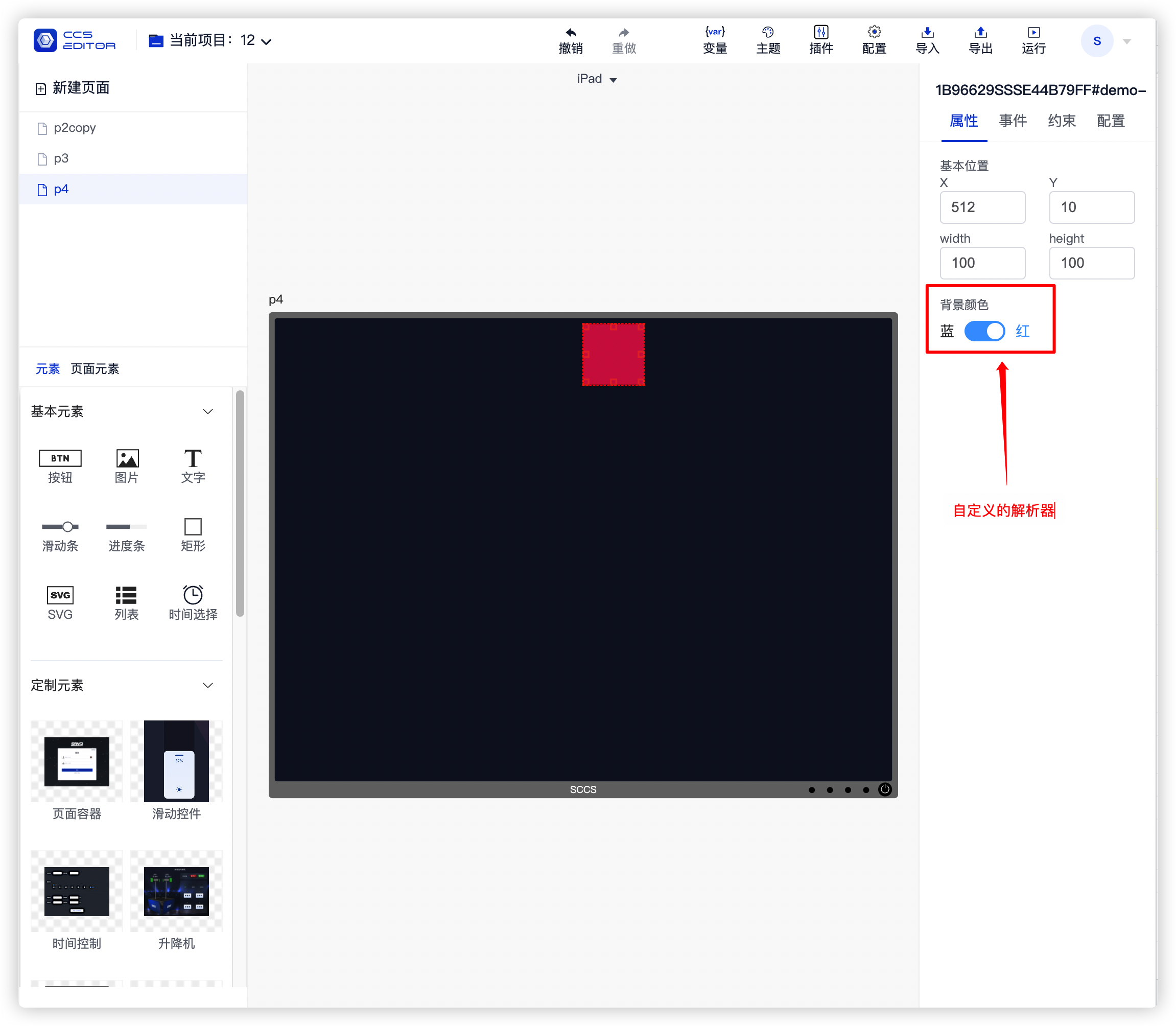
Below is the display effect of using this parser:
# 4. Important Notes
# 4.1 The Priority of Parsers Declared in Plugins
The name of the parser declared in the plugin takes precedence over the default parsers. If there is a naming conflict with built-in parsers, the one declared in the plugin will be used instead. For example, if the control platform provides a parser named switch and the plugin also declares a parser with the same name, specifying switch n the component's schema.attrs will use the one declared in the plugin rather than the default parser.
# 4.2 Parsers are Not Shared Among Different Plugins
Parsers declared in Plugin A cannot be used in Plugin B.
# Plugin Image Resource Reference Method
It is recommended to place plugin image resources in a unified directory and reference them using relative paths.
# HTML
 <img src="../assets/img/test.png" alt="" />
 <!--The following method is currently not supported-->
 <div style="background-image: url('../assets/img/test.png')" />
# JS
import img from '../assets/img/test.png'
# CSS
.image {
  background-image: url('../assets/img/test.png');
}
# Examples of Supported and Unsupported Reference Methods
<template>
  <div>
    <!--Valid -->
    <img src="../assets/img/test.png" alt="" />
    <div :style="testStyle">Valid Method</div>
    <div class="test">Valid Method</div>
    <div style="background-image: url('https://abc.com/assets/img/test.png')">Valid Method</div>
    <!--Invalid -->
    <div style="background-image: url('../assets/img/test.png')">Invalid Method</div>
    <div :style="{ backgroundImage: 'url(' + require('../assets/img/test.png') + ')' }">Invalid Method</div>
    <div :style="{ backgroundImage: 'url(' + import('../assets/img/test.png') + ')' }">Invalid Method</div>
  </div>
</template>

<script setup lang="ts">
import test from '../assets/img/test.png';
const testStyle = {
  backgroundImage: 'url(' + test + ')',
  color: 'red',
};
</script>

<style scoped lang="less">
.test {
  background-image: url('../assets/img/test.png');
}
</style>
# Updating the Plugin Itself
Plugins update themselves by calling the onViewChanged emit, as shown below:
<script setup lang='ts'>
  const props = defineProps(['view']);
  function updateViewData(data) {
    const view = props.view;
    view.data = data;
    emit('onViewChanged', { view });
  }
<script>
# Internationalization Support
For new projects, you can use ccs-pro version 2.1.0 or above and install the latest version of sccs (version 0.4.0 or above). When creating a project, it will include internationalization translation examples by default.
For older projects, you can upgrade to the internationalization-supporting version by following these steps.
# 1. Upgrade ccs-pro and sccs
Upgrade ccs-pro to version 2.1.0 or above.
Upgrade the sccs tool to version 0.4.0 or above.
# 2. Add i18n Translation Tool
Use the terminal in the project root directory to install the translation tool with the following command.
npm install vue-i18n -S
# 3. Create locales Translation Folder
Create a locales folder in the src directory and create the following files.
# i18n.ts
import { createI18n } from 'vue-i18n';
import en from './en';
import zh from './zh_CN';

export const i18n = createI18n({
  legacy: false,
  locale: localStorage.getItem('language') || 'zh_CN',
  globalInjection: false,
  messages: {
    zh_CN: zh,
    en: en,
  },
});

// @ts-ignore
export default i18n.global.t;
# en.js
const en = {
  lang: {
    language: 'English'
  },
};
export default en;
# zh_CN.js
const zh = {
  lang: {
    language: '中文'
  },
};
export default zh;
# 4. Component Translation
The component translation can be written as follows.
<template>
  <div class="test">
    <!--1. Use in template-->
    <div>{{ $t('lang.language') }}</div>
    <div>{{ language }}</div>
  </div>
</template>

<script setup lang='ts'>
// 2. Use in setup, note that the import of $t is in the script below
const language = $t('lang.language')
</script>
<script lang='ts'>
import icon from './assets/btn_on.webp';
import $t from '@/locales/i18n'

export default {
  startup: {
    // 3. Translate component name
    title: $t('lang.language'),
    icon: icon,
    init: {
      id: '',
      type: 'test',
      attrs: {},
      props: {
        frame: {y: 0, x: 0, width: 130, height: 50},
        config: {},
        hideCustomEvent: true, // Hide custom event
        constraints: [],
        attrs: {
          lang: '',
        },
      },
      children: []
    },
    schema: {
      attrs: [
        // 4. Translate component parameters
        {name: 'color', component: 'input', label: $t('lang.language')},
      ]
    }
  }
};
</script>

<style scoped lang='less'>
.test {
  color: white;
}
</style>
# 5. Plugin Name Icon Translation
Add a locales property in the main.json description file, and write it in the following format:
{
  "id": "demo",
  "version": "1.0.0",
  "icon": "icon_zh_CN.png",
  "name": "Unnamed Plugin",
  "description": "Default Description",
  "locales": {
    "en": {
      "icon": "icon.png",
      "name": "Demo Plugin",
      "description": "Demo Description"
    },
    "zh_CN": {
      "icon": "icon_zh_CN.png",
      "name": "示例插件",
      "description": "默认描述"
    }
  },
  "entry": [
    "index.js"
  ],
  "style": [
    "index.css"
  ]
}
# 5. Other Component Translations
Similarly, for other files, you can also import locales/i18n and use $t for translation.
# 6. for translation.
The reason is that the control platform needs to run multiple plugins simultaneously. If the global $t is enabled, then the translation data of the plugins needs to be merged into the global scope. It is currently not guaranteed that the namespace and prefixes of the plugins will not conflict, so the global $t is disabled to avoid misuses that may lead to conflicts between plugins.
All plugins should create their own local translations and manually import them before using the translation functionality.
# Appendix I: Definition of Editable Attribute Format for Plugins
Editable attributes for plugins are uniformly placed in init.props.attrs , and these attributes are described through schema.attrs . All attributes described by schema can be edited in the property panel of the control editor. Below are some commonly used data types, their corresponding description methods, and the final rendering effect in the property panel.
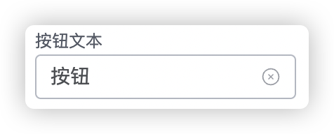
# input
⚠️Note: The remaining unrelated fields in the startup structure are omitted.
export default {
  startup: {
    init: {
      props: {
        // 1. Custom attrs properties
        attrs: {
          title: 'Button'
        },
      },
    },
    schema: {
      // 2. Declare attrs property parser
      attrs: [
        { name: 'title', component: 'input', label: 'Button Text', props: { clearable: true } }
      ]
    }
  }
};
props properties reference:Input Properties (opens new window)
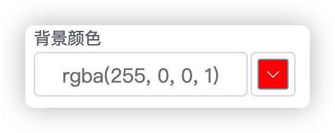
# color
export default {
  startup: {
    init: {
      props: {
        // 1. Custom attrs properties
        attrs: {
          bgColor: ''
        },
      },
    },
    schema: {
      // 2. Declare attrs property parser
      attrs: [
        { name: 'bgColor', component: 'color', label: '背景颜色', props: {} }
      ]
    }
  }
};
props attributes reference:color Properties (opens new window)
# pixel
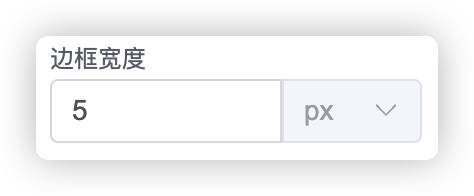
export default {
  startup: {
    init: {
      props: {
        // 1. Custom attrs properties
        attrs: {
          bdWidth: ''
        },
      },
    },
    schema: {
      // 2. Declare attrs property parser
      attrs: [
        { name: 'bdWidth', component: 'pixel', label: '边框大小', props: {} }
      ]
    }
  }
};
props attributes reference:Input Properties (opens new window)
# image
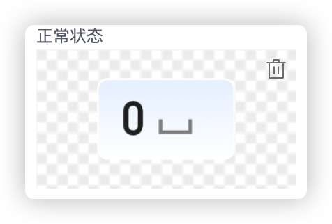
export default {
  startup: {
    init: {
      props: {
        // 1. Custom attrs properties
        attrs: {
          normalImage: '',
          activedImage: ''
        },
      },
    },
    schema: {
      // 2. Declare attrs property parser
      attrs: [
        { name: 'normalImage', component: 'image', label: 'Normal State', suggest: 'NORMAL', { useSmartLink: true, useSmartSize: true } },
        { name: 'activedImage', component: 'image', label: 'Active State', suggest: 'ACTIVE', { useSmartLink: true, useSmartSize: true } },
      ]
    }
  }
};
props properties reference:
| Property | Description | Type | Optional Values | Default Value |
|---|---|---|---|---|
| useSmartLink | Enable automatic linking (requires support from suggest) | boolean | — | false |
| useSmartSize | Automatically resize according to the image | boolean | — | false |
Supported parameters for the suggest attribute (enumeration):
| Parameter | Representation | Corresponding Suffix |
|---|---|---|
| NORMAL | Normal, Healthy | ['_n.', '_normal.', '_health.', '_zc.'] |
| ACTIVE | Active | ['_a.', '_active.'] |
| SELECTED | Selected | ['_s.', '_select.', '_selected.'] |
| DISABLED | Disabled | ['_d.', '_disable.', '_disabled.'] |
| UNBIND | Unbound | ['_unbound.', '_unbind.', '_none.'] |
| WARING | Warning | ['_warn.', '_waring.', '_yc.'] |
| ERROR | Error | ['_error.', '_abnormal.', '_gz.'] |
| UNKNOWN | Unknown | ['_unknown.', '_wz.'] |
Recommended suffix groups for suggest combinations.
// Button btn_n.png、btn_s.png、btn_a.png、btn_d.png
// Button btn_normal.png、btn_selected.png、btn_active.png、btn_disabled.png
// Health management health_zc.png、health_yc.png、health_gz.png、health_wz.png、health_none.png
// Health management health_normal.png、health_warn.png、health_error.png、health_unknown.png、health_unbind.png
It is known that buttons have four states (normal, active, selected, disabled). In general, when binding a button, it requires binding four times in sequence. This solution is used to optimize the binding logic for components like buttons, allowing multiple states' images to be bound in one go. However, the prerequisite is that this series of images must follow the specified naming rules.
For example: btn_n.png、btn_s.png、btn_a.png、btn_d.png
Then, in the corresponding schema attrs properties, declare the corresponding suggest properties as 'NORMAL', 'ACTIVE', 'SELECTED', 'DISABLED', and set useSmartLink to true to automatically achieve status linkage when selecting images.
# switch

export default {
  startup: {
    init: {
      props: {
        // 1. Custom attrs properties
        attrs: {
          autoCycle: false
        },
      },
    },
    schema: {
      // 2. Declare attrs property parser
      attrs: [
        { name: 'autoCycle', component: 'switch', props: { 'active-text': 'Auto Cycle' } }
      ]
    }
  }
};
props attributes reference: switch Properties (opens new window)
| Property | Description | Type | Optional Values | Default Value |
|---|---|---|---|---|
| exchangeWidthHeight | Automatically swap width and height after property changes | boolean | — | true |
Using this property allows for automatic switching of the view's width and height properties after the switch state changes.
# select
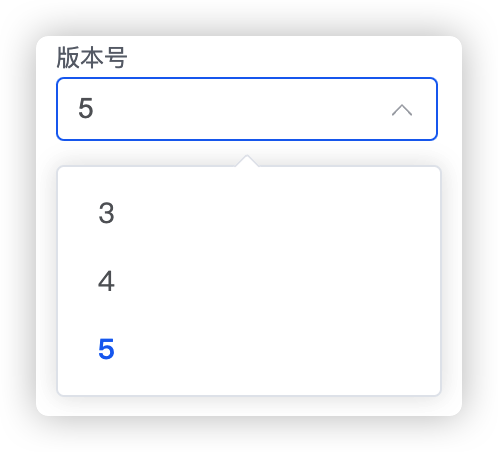
export default {
  startup: {
    init: {
      props: {
        // 1. Custom attrs properties
        attrs: {
          version: '5'
        },
      },
    },
    schema: {
      // 2. Declare attrs property parser
      attrs: [
        { name: 'version', component: 'select', label: '版本号', props: { options: ['3', '4', '5'] } }
      ]
    }
  }
};
props attributes reference: select 属性 (opens new window)
# font-size
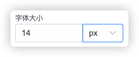
export default {
  startup: {
    init: {
      props: {
        // 1. Custom attrs properties
        attrs: {
          fontSize: '14px'
        },
      },
    },
    schema: {
      // 2. Declare attrs property parser
      attrs: [
        { name: 'fontSize', component: 'font-size', label: '字体大小', props: {} }
      ]
    }
  }
};
props attributes reference: Input 属性 (opens new window)
# alignment
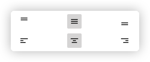
Centering property used to determine the centering characteristics of the content.
Declaring properties:
export default {
  startup: {
    init: {
      props: {
        // 1. Custom attrs properties
        attrs: {
          alignment: ['center', 'center']
        },
      },
    },
    schema: {
      // 2. Declare attrs property parser
      attrs: [
        { name: 'alignment', component: 'alignment' }
      ]
    }
  }
};
Using properties:
Most logic omitted, only core content retained.
<template>
  <div class="text" :style="[itemStyle]"></div>
</template>
<script lang="ts">
export default {
  setup(props: any) {
    const itemStyle = computed(() => ({
      '--align-item': attrs.value.alignment?.[1] ?? 'center',
      '--justify-content': attrs.value.alignment?.[0] ?? 'center'
    }));

    return {
      itemStyle
    };
  }
};
</script>

<style lang="less" scoped>
.text {
  position: relative;
  width: 100%;
  height: 100%;
  overflow: hidden;
  display: flex;
  justify-content: var(--justify-content);
  align-items: var(--align-item);
  text-align: var(--justify-content);
}
</style>
# font-bold | font-italic | font-underline
This group of attributes is used to control the styles of the font.
Declaring properties:
export default {
  startup: {
    init: {
      props: {
        // 1. Custom attrs properties
        attrs: {
          bold: false,
          italic: false,
          underline: false
        },
      },
    },
    schema: {
      // 2. Declare attrs property parser
      attrs: [
        {
          name: 'bold',
          component: 'font-bold',
          style: { display: 'inline-flex', justifyContent: 'start', width: '33%' }
        },
        {
          name: 'italic',
          component: 'font-italic',
          style: { display: 'inline-flex', justifyContent: 'center', width: '34%' }
        },
        {
          name: 'underline',
          component: 'font-underline',
          style: { display: 'inline-flex', justifyContent: 'flex-end', width: '33%' }
        }
      ]
    }
  }
};
Using properties:
Most logic omitted, only core content retained.
<template>
  <div class="text" :style="[itemStyle]"></div>
</template>
<script lang="ts">
export default {
  setup(props: any) {
    const itemStyle = computed(() => ({
      '--bold': attrs.value.bold ? 'bold' : 400,
      '--italic': attrs.value.italic ? 'italic' : 'initial',
      '--underline': attrs.value?.underline ? 'underline' : 'none'
    }));

    return {
      itemStyle
    };
  }
};
</script>

<style lang="less" scoped>
.text {
  position: relative;
  width: 100%;
  height: 100%;
  overflow: hidden;
  display: flex;
  font-weight: var(--bold);
  font-style: var(--italic);
  text-decoration: var(--underline);
}
</style>
# font-family
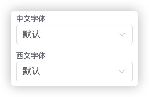
Used to define font properties.
Declaring properties:
export default {
  startup: {
    init: {
      props: {
        // 1. Custom attrs properties
        attrs: {
          latinFamily: '',
          asianFamily: ''
        },
      },
    },
    schema: {
      // 2. Declare attrs property parser
      attrs: [
        { name: 'asianFamily', component: 'font-family', label: '中文字体' },
        { name: 'latinFamily', component: 'font-family', label: '西文字体' }
      ]
    }
  }
};
Using properties:
Most logic omitted, only core content retained.
<template>
  <div class="text" :style="[itemStyle]"></div>
</template>
<script lang="ts">
export default {
  setup(props: any) {
    const itemStyle = computed(() => {
      // Load fonts
      let family = '';
      if (attrs.value?.latinFamily) family += attrs.value?.latinFamily + ','; // Western font
      if (attrs.value?.asianFamily) family += attrs.value?.asianFamily + ','; // Chinese font
      if (family) family += 'serif'; // Default font
      return {
        '--family': family
      };
    });

    return {
      itemStyle
    };
  }
};
</script>

<style lang="less" scoped>
.text {
  position: relative;
  width: 100%;
  height: 100%;
  overflow: hidden;
  display: flex;
  font-family: var(--family);
}
</style>
# padding
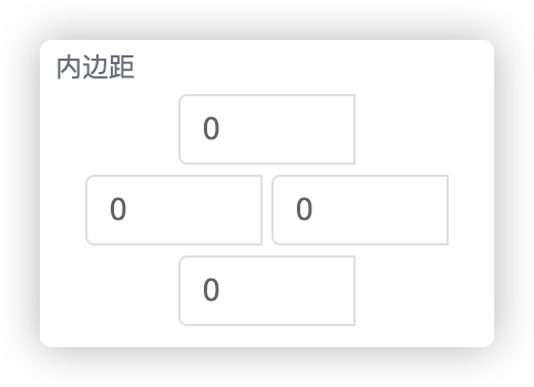
The padding property is used to handle inner padding.
Declaring properties:
export default {
  startup: {
    init: {
      props: {
        // 1. Custom attrs properties
        attrs: {
          padding: [0, 0, 0, 0]
        },
      },
    },
    schema: {
      // 2. Declare attrs property parser
      attrs: [
         { name: 'padding', component: 'padding', label: '内边距' }
      ]
    }
  }
};
Using properties:
Most logic omitted, only core content retained.
<template>
  <div class="text" :style="[itemStyle]"></div>
</template>
<script lang="ts">
export default {
  setup(props: any) {
    const itemStyle = computed(() => ({
      padding: attrs.value.padding ? attrs.value.padding.join('px ') + 'px' : '',
    }));

    return {
      itemStyle
    };
  }
};
</script>

<style lang="less" scoped>
.text {
  position: relative;
  width: 100%;
  height: 100%;
  overflow: hidden;
  display: flex;
}
</style>
# button-emit
export default {
startup: {
init: {
props: {
// 1. Custom attrs properties
attrs: {},
},
},
schema: {
// 2. Declare attrs property parser
attrs: [
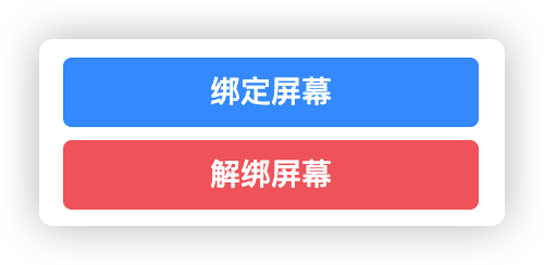
{ component: 'button-emit', props: { name: '绑定屏幕', action: 'bindScreen', type: 'primary' } },
{ component: 'button-emit', props: { name: '解绑屏幕', action: 'unbindScreen', type: 'danger' } },
]
}
}
};
Receive emit events:
<script setup lang="ts">
  const { proxy }: any = getCurrentInstance();
  onMounted(() => proxy.$mitt.on(props.view.props.id, emitAction));
  onBeforeUnmount(() => proxy.$mitt.off(props.view.props.id, emitAction));

  function emitAction(event: any) {
    if (event === 'bindScreen') showBindDialog();
    else if (event === 'unbindScreen') tryUnbind();
  }
</script>
props attributes reference: button 属性 (opens new window)
# Appendix II: Complete Plugin Component Example
This example demonstrates some basic functionalities that can be used in a plugin component:
- Component code structure.
- Custom styles for the component.
- Use of the component data pool.
- Data interaction between the configuration panel and the component.
Due to the need to demonstrate a lot of content, the code logic is relatively long, but some of the functionalities are not mandatory and can be trimmed according to actual needs.
<template>
  <div :style='btnStyle' class='my-btn'
       @click.stop='switchPower'>
    <div style='width: 100%; line-height: 100%; text-align: center'>{{ text }}</div>
  </div>
</template>

<script setup lang='ts'>
import { ElMessage } from 'element-plus';
import { useActions, useState } from '@hooks/useVuex';
import { computed, getCurrentInstance, onBeforeUnmount, onMounted } from 'vue';

// region External Parameters ------------------------------------------------------------
const props = defineProps(['view', 'edit_mode']);
const states = useState('store', ['power', 'prefix']);
const { switchPower } = useActions('store', ['switchPower']);
// endregion

// region Content Style ------------------------------------------------------------
const text = computed(() => states.prefix.value + '-' + (states.power.value === 'on' ? 'Off' : 'on'));

import btn_on_n from './assets/btn_on.webp';
import btn_off_n from './assets/btn_off.webp';

const btnStyle = computed(() => {
  const attrs = props.view?.props?.attrs;
  const bgOnImg = attrs?.powerOnImage || btn_on_n;
  const bgOffImg = attrs?.powerOffImage || btn_off_n;
  const bgImg = states.power.value === 'on' ? bgOffImg : bgOnImg;
  return {
    color: attrs?.color,
    fontSize: attrs?.fontSize || '14px',
    borderColor: attrs?.borderColor,
    borderWidth: attrs?.borderWidth || '0px',
    borderRadius: attrs?.borderRadius || '5px',
    borderStyle: 'solid',
    backgroundColor: attrs?.backgroundColor,
    backgroundImage: `url(${bgImg})`,
    backgroundSize: '100% 100%'
  };
});
// endregion

// region Attribute Button Callback ------------------------------------------------------------
const { proxy } = getCurrentInstance() as any;
onMounted(() => proxy.$mitt.on(props.view.props.id, emitAction));
onBeforeUnmount(() => proxy.$mitt.off(props.view.props.id, emitAction));

function emitAction(event: any) {
  if (event === 'bindDevice') {
    ElMessage.success('ind button clicked');
  }
}

// endregion
</script>
<script lang='ts'>
import icon from './assets/btn_on.webp';

export default {
  // v3pro button
  name: 'PowerButton',

  startup: {
    title: 'Power Button',
    icon: icon,
    init: {
      id: '',
      type: 'power-button',
      attrs: {},
      props: {
        frame: { y: 0, x: 0, width: 130, height: 50 },
        config: {},
        title: '开关',
        hideCustomEvent: true, // Hide custom event
        constraints: [],
        attrs: {
          color: '',
          backgroundColor: '',
          borderColor: '',
          fontSize: '14px',
          borderWidth: '0px',
          borderRadius: '5px',
          powerOnImage: '',
          powerOffImage: ''
        },
      },
      children: []
    },
    schema: {
      attrs: [
        { name: 'color', component: 'color', label: 'Color' },
        { name: 'backgroundColor', component: 'color', label: 'Background Color' },
        { name: 'borderColor', component: 'color', label: 'Border Color' },
        { name: 'fontSize', component: 'font-size', label: 'Font Size' },
        { name: 'borderWidth', component: 'pixel', label: 'Border Width' },
        { name: 'borderRadius', component: 'pixel', label: 'Border Radius' },
        { component: 'button-emit', props: { name: '绑定测试', action: 'bindDevice', type: 'primary' } },
        { name: 'powerOnImage', component: 'image', label: 'Active State' },
        { name: 'powerOffImage', component: 'image', label: 'Inactive State' }
      ]
    }
  }
};
</script>

<style scoped lang='less'>

.my-btn {
  width: 100%;
  height: 100%;
  position: absolute;
  display: flex;
  align-items: center;

  &:hover {
    opacity: 0.85;
  }

  &:active {
    opacity: 1;
  }
}
</style>
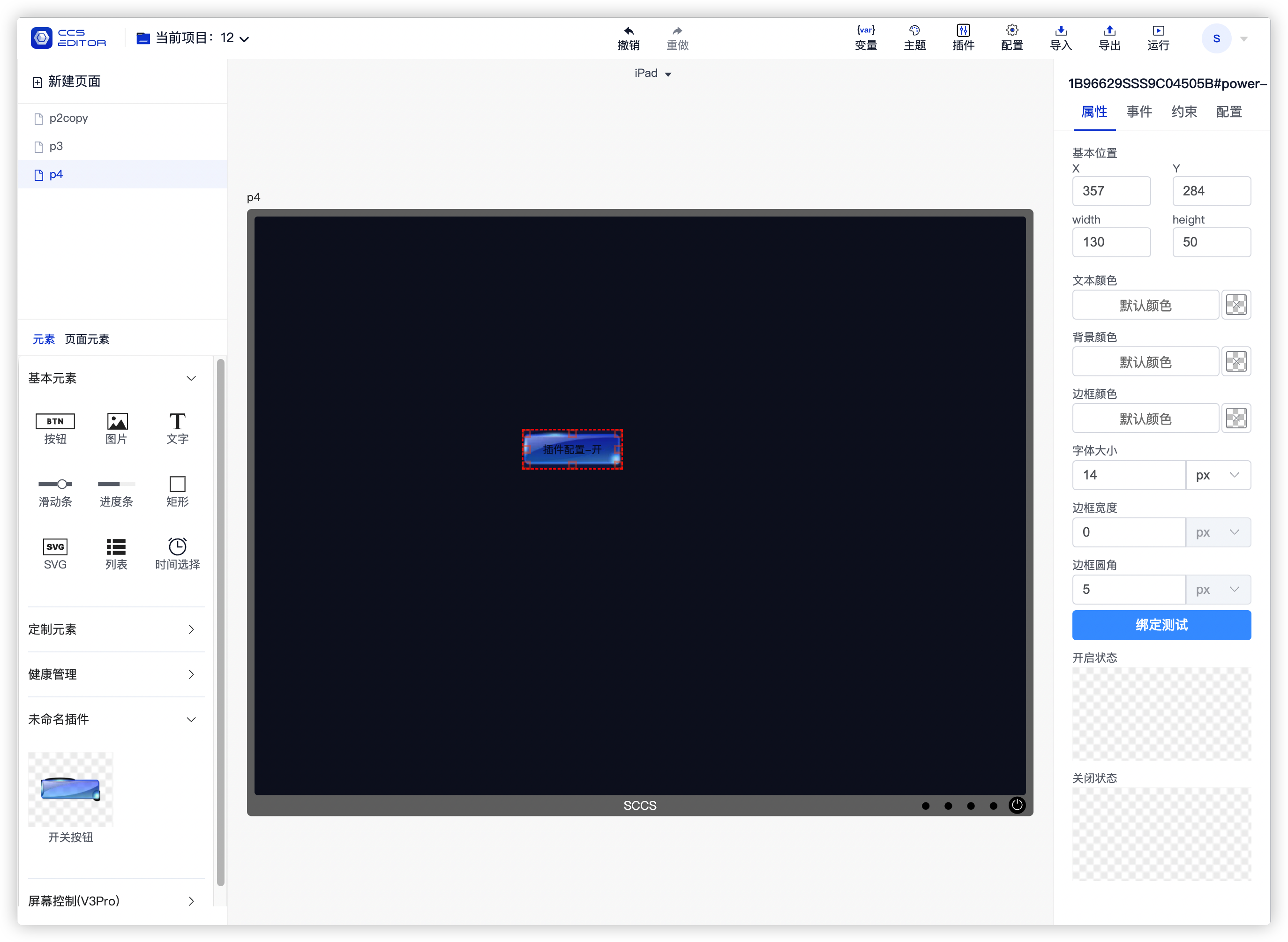
The above component will be rendered in the control editor as shown. The plugin name and preview icon will display on the left, and it can be dragged and added to the central editing area. Upon selecting this component, the related attribute information defined by attrs will be visible in the properties panel on the right.
# Appendix III: Global Data
Global data is provided through Vue's provider and inject methods; for details, refer to Provide / Inject (opens new window)
Titles with parentheses indicate the minimum required version; for example, (2.0.8+) means that the minimum required version to use this feature is ccs-pro 2.0.8.
# 1. Get Components of a Certain Type in the Project (2.0.8+)
You may need to read information about a certain type of component in the current project, such as how many cabinets there are and the contents of each cabinet, or how many container control components are present in the current project.
Here’s an example of how to get all button components in the current project:
const getViewByType = inject<(type: string) => any[]>('getAllViewsByType');
if (getViewByType) {
  const buttons = getViewByType('button')
  console.log(buttons);
}
# 2. Get Current User (2.0.8+)
Used to obtain the currently logged-in user, including username and role fields. The usage is as follows:
const getCurrentUser = inject<() => { username: string; role: string }>('getCurrentUser');
const user = getCurrentUser();
if (user) {
  console.log('Username:', user.username);
  if (user.role === 'admin') {
    console.log('Role: Administrator');
  } else if (user.role === 'user') {
    console.log('Role: Regular User');
  }
}
# 3. Get All Pages in the Current Project (2.0.14+)
Retrieve detailed information about all pages in the current project:
const pages = inject('pages');
console.log('pages', pages);
# 4. Get Details of the Current Page (2.0.14+)
Retrieve details about the current page:
const currentPage = inject('currentPage');
console.log('currentPage', currentPage);
# 4. Get Details of the Current Project (2.0.14+)
Retrieve details about the current project:
const currentProject = inject('currentProject');
console.log('currentProject', currentProject);
# Appendix IV: Avoiding Style Conflicts Between Plugins
Different plugins might have the same class attributes. If CSS properties are written directly, it may lead to style properties of two different plugins affecting each other, resulting in unexpected outcomes.
To avoid plugin influence, you can use the scoped attribute to ensure styles only take effect locally. However, some components like tables and dialogs may not work properly with scoped alone. In such cases, you should combine custom container classes and the deep attribute to prevent conflicts.
# Handling Styles for Element Components When Using Scoped
# Normally, if you want to modify the style of a table in the page, it would look like this:
If scoped is added, the style may not be modified;
<template>
    <div class="table-mod">
      <el-table
        :data="[]"
        style="width: 100%"
      >
        <el-table-column
          label="test"
          prop="name"
          width="150"
        ></el-table-column>
      </el-table>
    </div>
</template>
<style lang="less" scoped>
.table-mod{
    .el-table {
      background-color: transparent;
      --el-table-row-hover-bg-color: transparent;
    }
}
</style>
You can simply add :deep() to make the styling effective:
<template>
    <div class="table-mod">
      <el-table
        :data="[]"
        style="width: 100%"
      >
        <el-table-column
          label="test"
          prop="name"
          width="150"
        ></el-table-column>
      </el-table>
    </div>
</template>
<style lang="less" scoped>
:deep(.table-mod){
    .el-table {
      background-color: transparent;
      --el-table-row-hover-bg-color: transparent;
    }
}
</style>
# If the Dialog is a Component, normally the code would look like this:
You would find that the custom styles for the dialog do not take effect:
<template>
    <el-dialog class="contain">
       <div>
          This is the content of the dialog.
       </div>
    </el-dialog>
</template>
<style lang="less" scoped>
.contain{
    .el-dialog__header {
      display: none;
    }
}
</style>
# At this point, you need to:
# 1. Wrap the dialog in a parent layer.
# 2.Specify the root element for the dialog.
# 3、Use :deep()
# To make the styling effective:
<template>
    <div class="div-container">
        <el-dialog
        class="contain"
        :append-to="'.div-container'"
        >
            <div>
                This is the content of the dialog.
            </div>
        </el-dialog>
    </div>
</template>
<style lang="less" scoped>
:deep(.contain){
    .el-dialog__header {
      display: none;
    }
}
</style>
# Common Issues
# After upgrading the sccs version, compilation error TS2580: Cannot find name 'process'
Error occurred: {
  code: 'ERROR',
  error: [TS2580: Cannot find name 'process'. Do you need to install type definitions for node? Try `npm i --save-dev @types/node`.] {
    frame: '\n' +
      '\x1B[7m86\x1B[0m   console.log("process.env.NODE_ENV =", process.env.NODE_ENV);\n' +
      '\x1B[7m  \x1B[0m \x1B[91m                                        ~~~~~~~\x1B[0m\n',
    code: 'PLUGIN_ERROR',
    length: 7,
    loc: {
      file: '/Users/gcssloop/WorkSpace/Sansi/sccs-plugin/sccs-plugin-v3pro/src/views/V3PowerButton.vue?vue&type=script&setup=true&lang.ts',
      line: 86,
      column: 41
    },
    pos: 0,
    pluginCode: 'TS2580',
    plugin: 'Typescript',
    hook: 'generateBundle'
  },
...
}
Solution: Run npm i --save-dev @types/node as suggested.